UI Design Internship
at Strarts - 2023
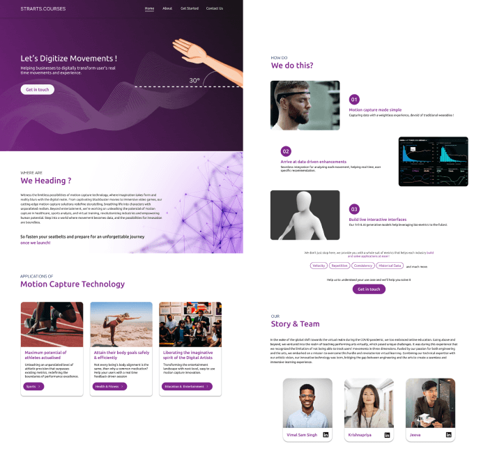
Designed a website from scratch for their upcoming R&D project on Motion Capture Technology.
Overview
Strarts is a ed-tech startup focused on teaching performing arts virtually. Their upcoming project is to revolutionize virtual learning by integrating Motion capture technology to track users' movements in three dimensions while teaching performing arts online.
During my internship, I was assigned to design a website from scratch to showcase their ideas and what the technology they were working on.
Role
Tools used
Timeline
UI Designer
Figma
June 2023 - 3 weeks
Process
The website's design process involved drawing inspiration, iterative design refinement, stakeholder meetings, and user testing. It proceeded swiftly and efficiently, thanks to the clear vision of the stakeholders, which greatly facilitated the design process.
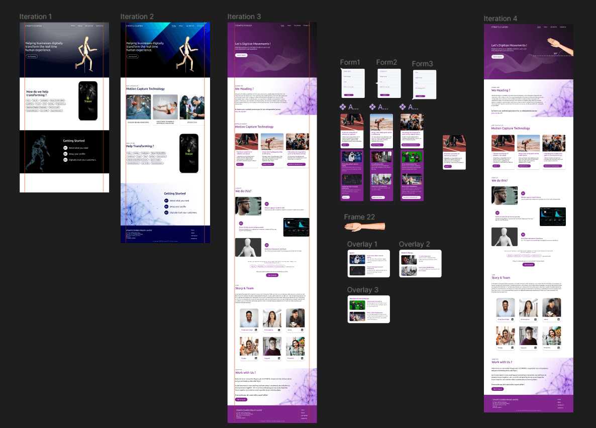
The website went through 4 iterations majorly, in a span of 3 weeks based on discussions with the stakeholders. Though I can not discuss the whole process, I shall talk about a few design decisions that were made, in the following section.
Touch Points:
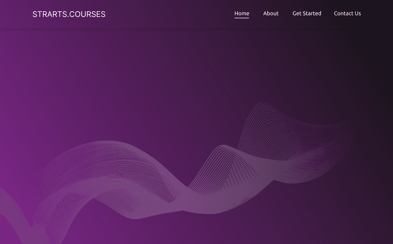
Color is a pivotal element in visual design. Initially, we experimented with shades of black and blue for the first few iterations, but later, we transitioned to a subtle gradient of purple and black.
This shift was primarily due to the overuse of blue in many tech company websites. Hence, a more distinctive and fitting alternative was sought. Ultimately, purple proved to be the ideal choice.
Iteration 1 :
Final Iteration :
Iteration 2 :
Colour
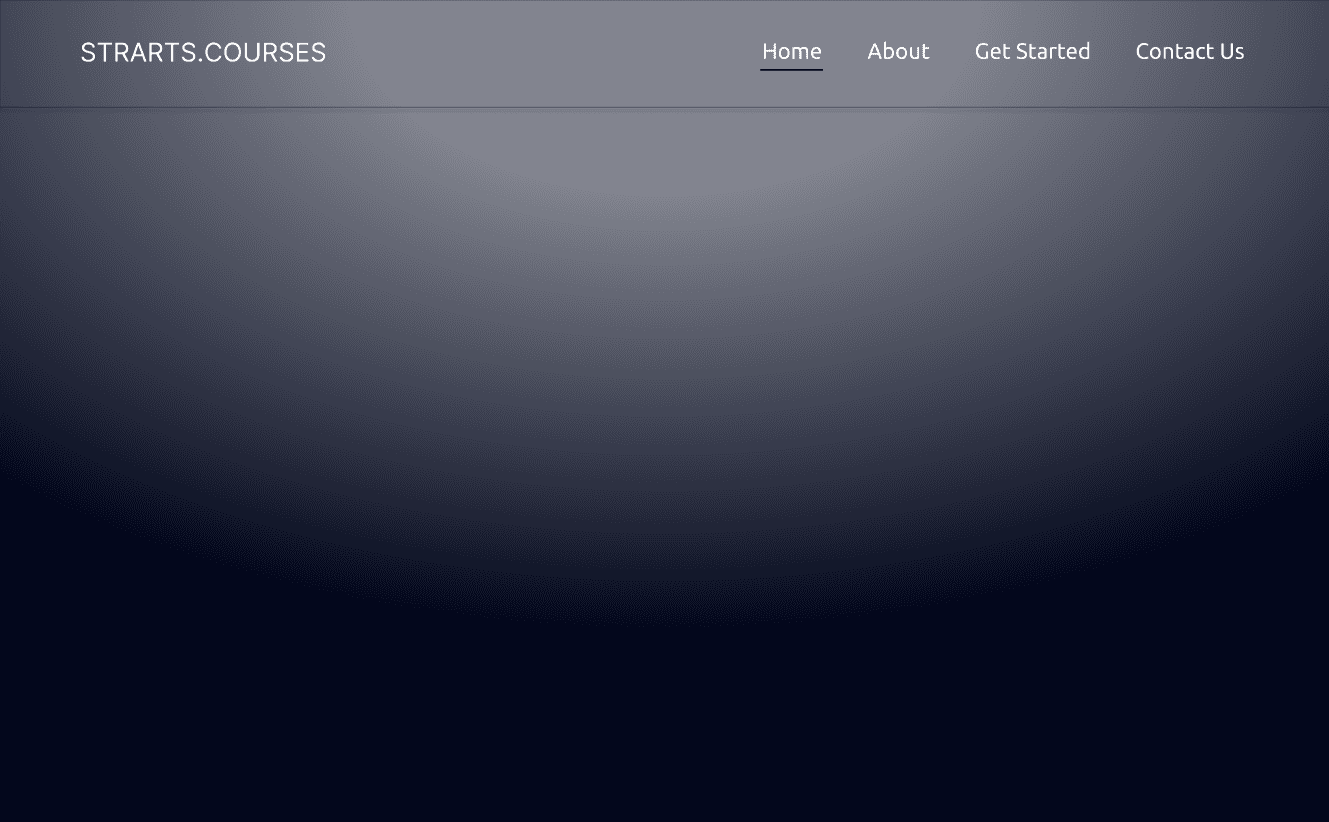
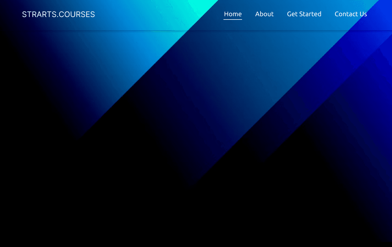
Iteration 1 :
Iteration 2 :
Final Iteration :
Sections dedicated to explaining how the Strarts team leverages motion capture technology to transform businesses, our initial iterations simply featured concise one-word key points about this technology, accompanied by a prototype of our innovation.
However, during user testing, we discovered that these key points were not effectively communicating the concept, as our audience included both experts in this niche tech and newcomers.
Content Relevance and Imagery
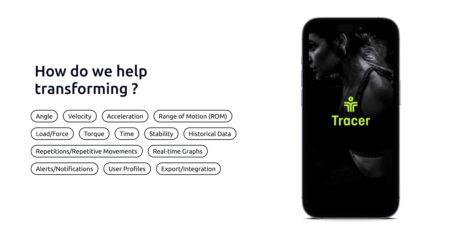

Therefore, it became important to provide a comprehensive explanation of motion capture technology, supported by detailed content and relevant imagery, to enhance the user experience on the website.

Card UI of ‘Applications of Motion Capture Technology’
Once we recognized the necessity of explaining motion capture technology, the attention shifted towards finding the best way to present this information.
The applications section required comprehensive content while maintaining a clean and uncluttered appearance. To strike this balance, we introduced the idea of offering more detailed explanations for each application through a 'Call to Action' (CTA) button.
In the initial iteration, this CTA button revealed a vertical dropdown card featuring two specific applications within the broader category.
However, we faced a design challenge: “What if more applications needed to be added in the future? “
Simply increasing the height of the vertical card wouldn't align with good visual design principles. As a solution, in the subsequent iteration, we implemented a horizontal card overlay to address this issue.
Iteration 1 :

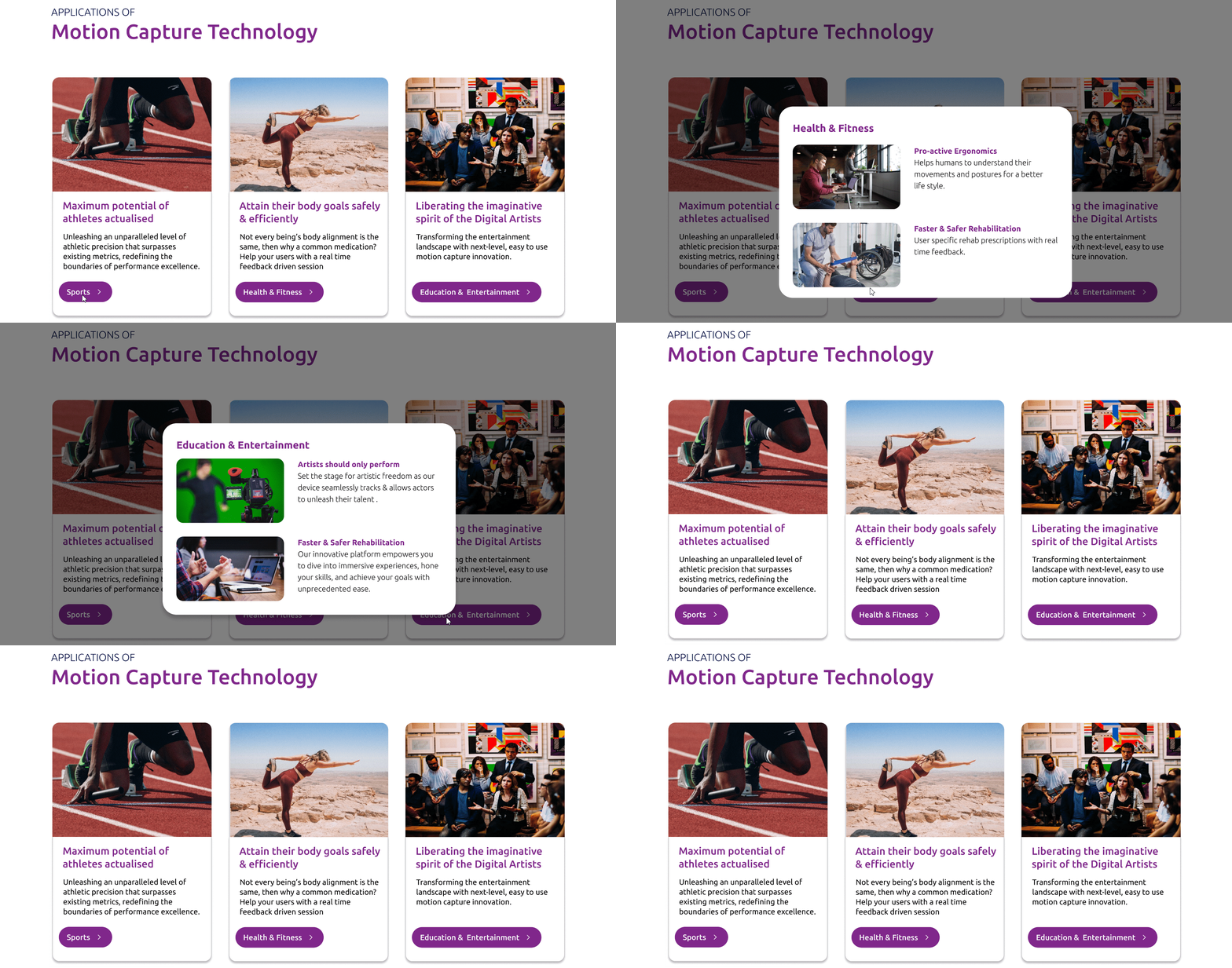
Final Iteration :

Pop up modal contact forms:
While it is essential to understand user needs in the design process, it's equally vital to align with stakeholder requirements.
An example of this approach is the use of pop-up modals for contact forms triggered immediately upon clicking the 'Get in Touch' button. This choice aimed to actively engage users in filling out the form right after clicking the CTA button, instead of redirecting them to a different section or page.
While the conventional approach typically involves dedicating a separate page or section to contact forms, the decision to employ pop-up modals in this case was solely driven by stakeholder input.


Final Design
Takeaway
During my tenure at Strarts, I had the opportunity to delve into a technology domain that was entirely new to me. This experience provided me with valuable insights into the practical application of design principles in the real world.
It taught me that design is not just about inspiration but also about the iterative process of creating, refining, and seeking feedback to make continuous improvements.
I came to realize the significance of effective collaboration with stakeholders, aligning with their requirements, while always keeping a sharp focus on meeting the needs of the users
at Strarts - 2023
Designed a website from scratch for their upcoming R&D project on Motion Capture Technology.
UI Design Internship


Touch Points:
Overview
Strarts is a ed-tech startup focused on teaching performing arts virtually. Their upcoming project is to revolutionize virtual learning by integrating Motion capture technology to track users' movements in three dimensions while teaching performing arts online.
During my internship, I was assigned to design a website from scratch to showcase their ideas and what the technology they were working on.
Tools used
Figma
Timeline
July 2023 -
3 weeks
Role
UI Designer


Process
The website's design process involved drawing inspiration, iterative design refinement, stakeholder meetings, and user testing. It proceeded swiftly and efficiently, thanks to the clear vision of the stakeholders, which greatly facilitated the design process.
The website went through 4 iterations majorly, in a span of 3 weeks based on discussions with the stakeholders. Though I can not discuss the whole process, I shall talk about a few design decisions that were made, in the following section.
Touch Points:
Colour
Color is a pivotal element in visual design. Initially, we experimented with shades of black and blue for the first few iterations, but later, we transitioned to a subtle gradient of purple and black.
This shift was primarily due to the overuse of blue in many tech company websites. Hence, a more distinctive and fitting alternative was sought. Ultimately, purple proved to be the ideal choice.
Iteration 1 :


Iteration 2 :


Final Iteration :


Content Relevance and Imagery
Sections dedicated to explaining how the Strarts team leverages motion capture technology to transform businesses, our initial iterations simply featured concise one-word key points about this technology, accompanied by a prototype of our innovation.
Iteration 1 :


However, during user testing, we discovered that these key points were not effectively communicating the concept, as our audience included both experts in this niche tech and newcomers.
Iteration 2 :


Therefore, it became important to provide a comprehensive explanation of motion capture technology, supported by detailed content and relevant imagery, to enhance the user experience on the website.
Final Iteration :


Card UI of ‘Applications of Motion Capture Technology’
Once we recognized the necessity of explaining motion capture technology, the attention shifted towards finding the best way to present this information.
The applications section required comprehensive content while maintaining a clean and uncluttered appearance. To strike this balance, we introduced the idea of offering more detailed explanations for each application through a 'Call to Action' (CTA) button.
In the initial iteration, this CTA button revealed a vertical dropdown card featuring two specific applications within the broader category.
Iteration 1 :


However, we faced a design challenge: “What if more applications needed to be added in the future? “
Simply increasing the height of the vertical card wouldn't align with good visual design principles. As a solution, in the subsequent iteration, we implemented a horizontal card overlay to address this issue.
Final Iteration :


Pop up modal contact forms:
While it is essential to understand user needs in the design process, it's equally vital to align with stakeholder requirements.
An example of this approach is the use of pop-up modals for contact forms triggered immediately upon clicking the 'Get in Touch' button. This choice aimed to actively engage users in filling out the form right after clicking the CTA button, instead of redirecting them to a different section or page.
While the conventional approach typically involves dedicating a separate page or section to contact forms, the decision to employ pop-up modals in this case was solely driven by stakeholder input.
Final Design


Takeaway
During my tenure at Strarts, I had the opportunity to delve into a technology domain that was entirely new to me. This experience provided me with valuable insights into the practical application of design principles in the real world.
It taught me that design is not just about inspiration but also about the iterative process of creating, refining, and seeking feedback to make continuous improvements.
I came to realize the significance of effective collaboration with stakeholders, aligning with their requirements, while always keeping a sharp focus on meeting the needs of the users
All rights reserved.
All rights reserved.