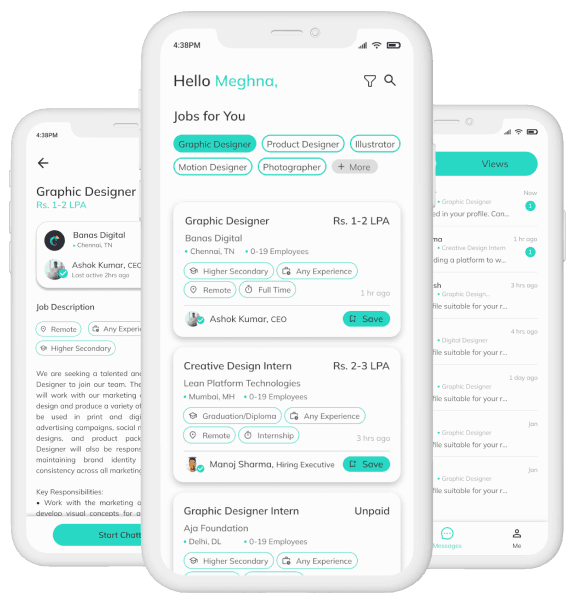
Let me take you through my process of redesigning the Hirect app. This is a personal project.
What is Hirect?
Hirect is a leading job portal in India that enables direct connections between job seekers and hiring managers so that they can chat instantly for free, while its AI algorithm ensures personalized job recommendations based on skills, experience, and professional goals.
Hirect has both the job seeker side and the recruiter side of the app. In this case study, I have focused only on redesigning the job seeker side of the app.
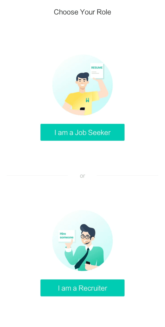
The typical journey of a job seeker on Hirect looks like this:
Step 1
Step 2
Step 3
Build your profile
Chat directly with recruiters
Get Hired
Why the Redesign?
As a college student searching for internships and part-time jobs, I discovered the Hirect app. Though initially it appeared simple, on further use I found it to be plagued with numerous design flaws in terms of visual design and user experience. Upon realizing that others around me also faced similar issues, I felt the design could be a lot more streamlined and visually appealing.
Tool used
Figma
Role
Product
Designer
Timeline
July 2023-
4 weeks
Design Process
Understanding the existing app
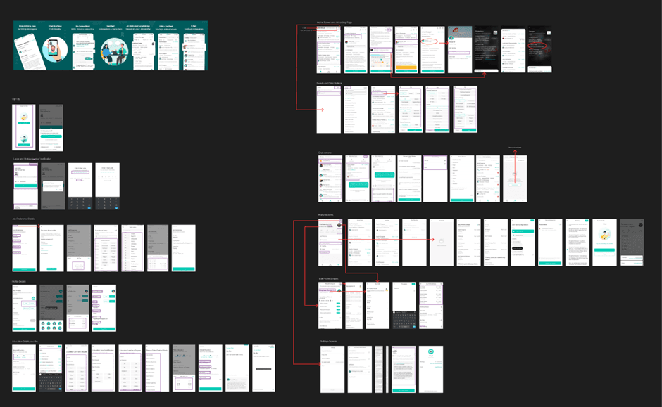
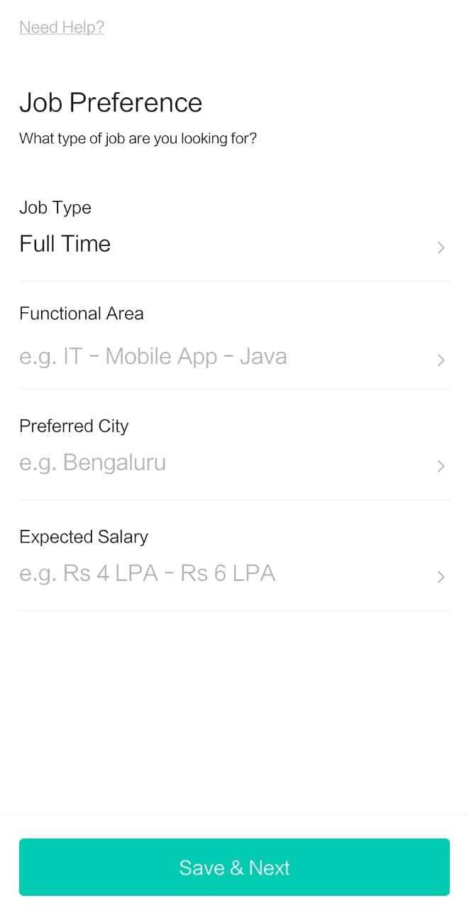
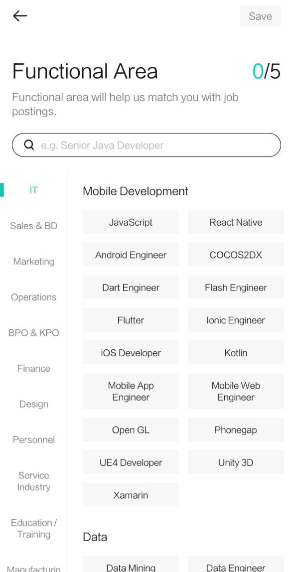
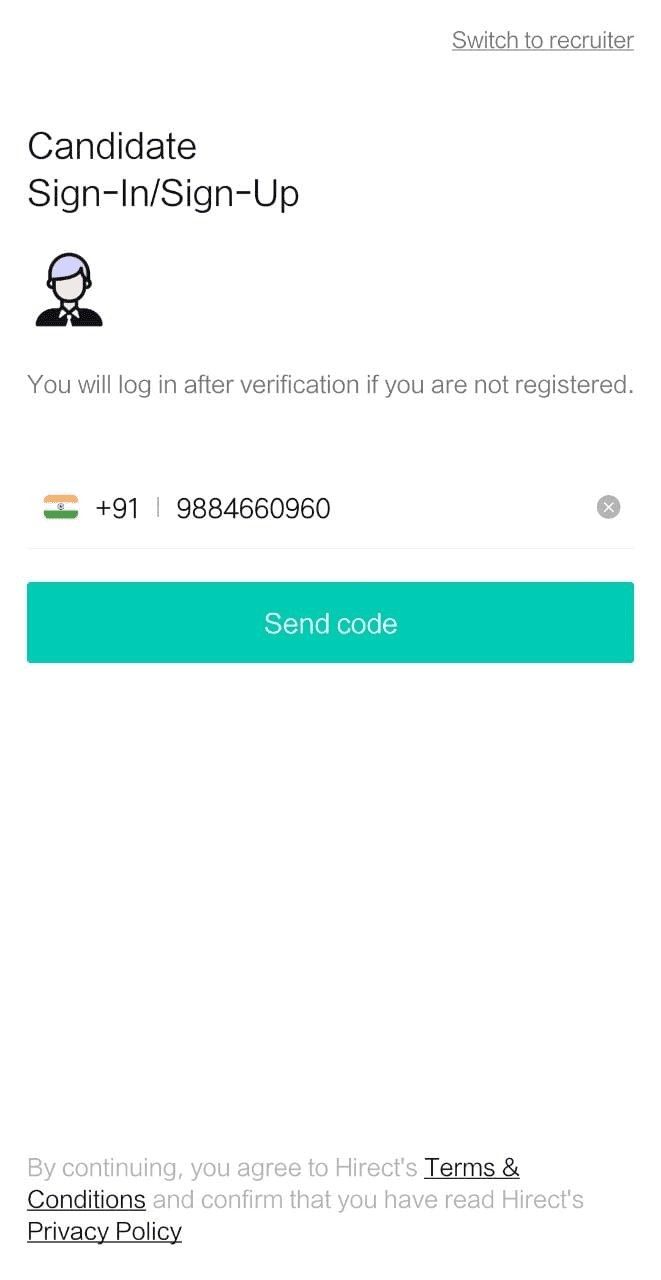
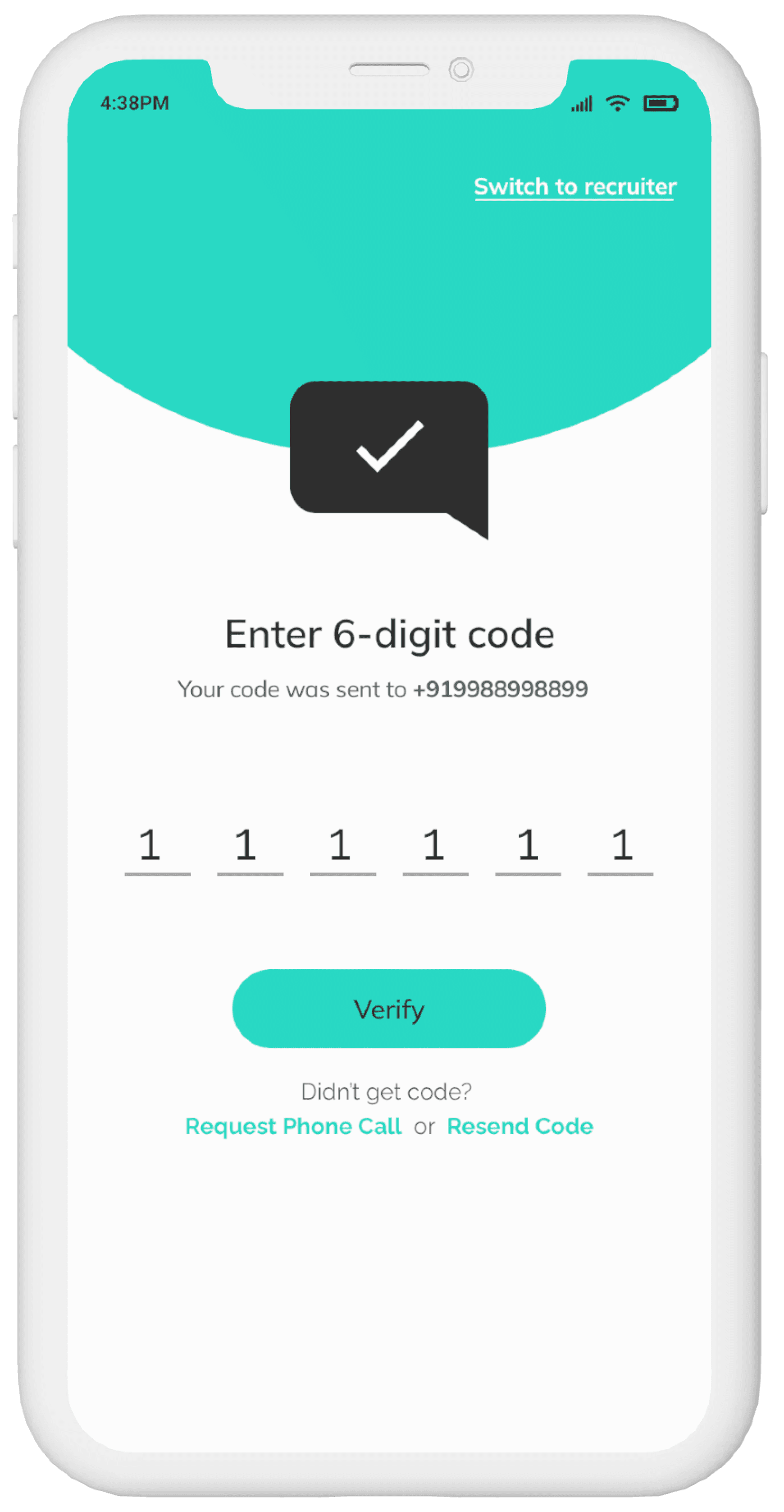
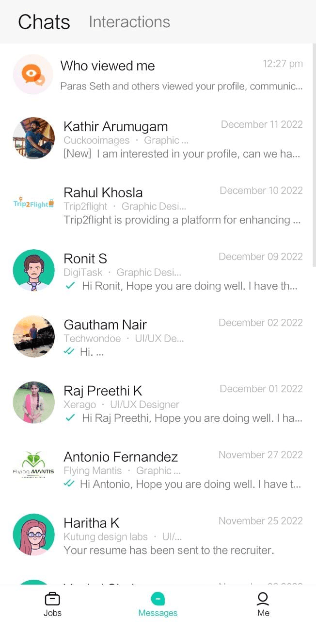
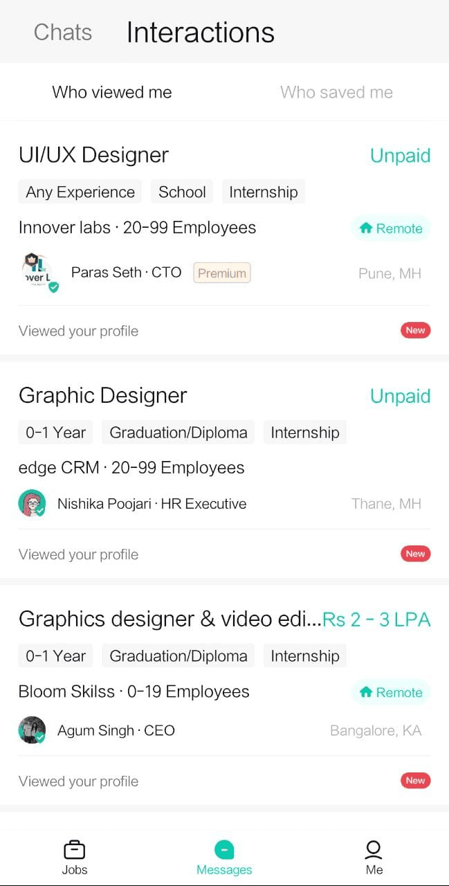
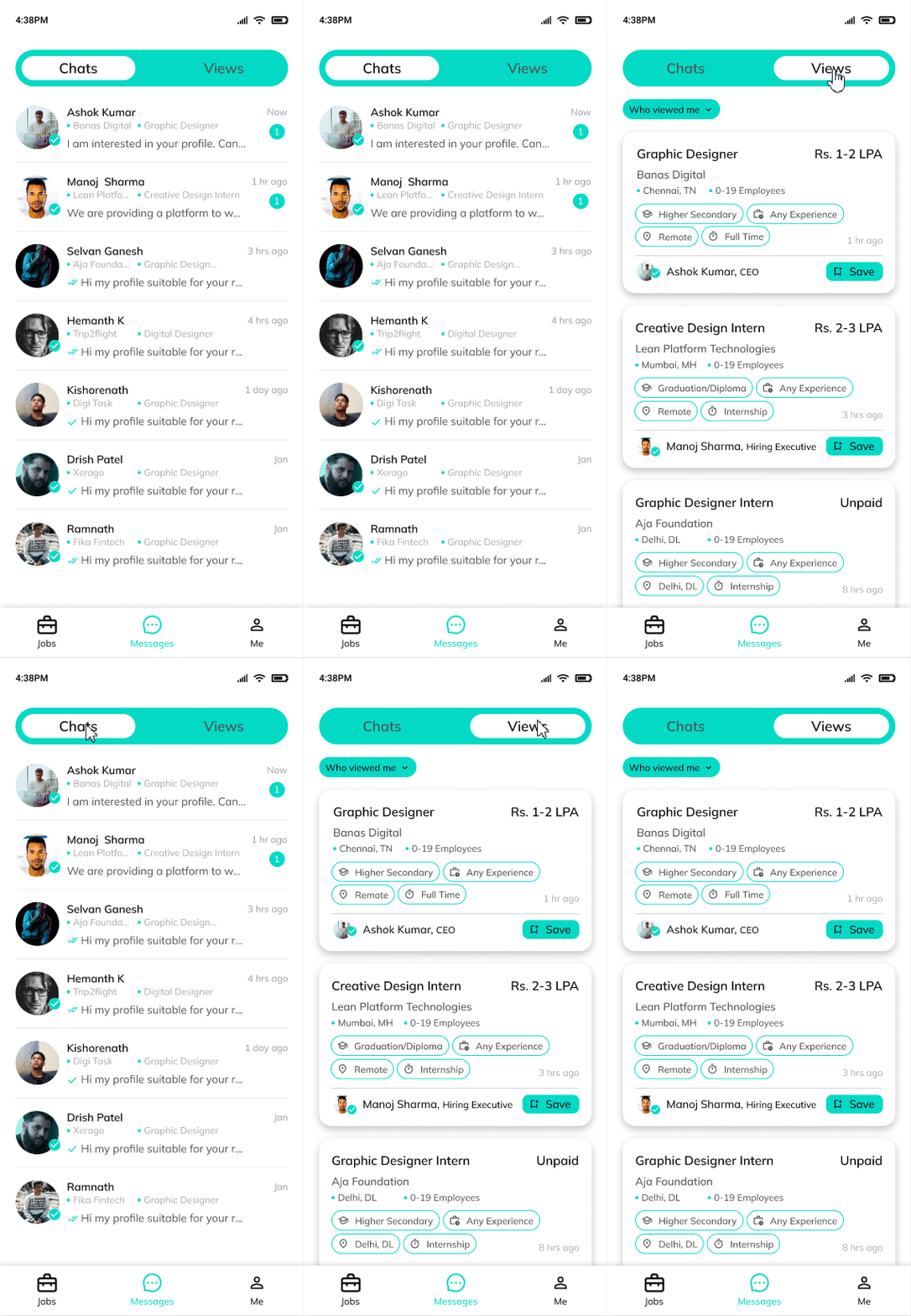
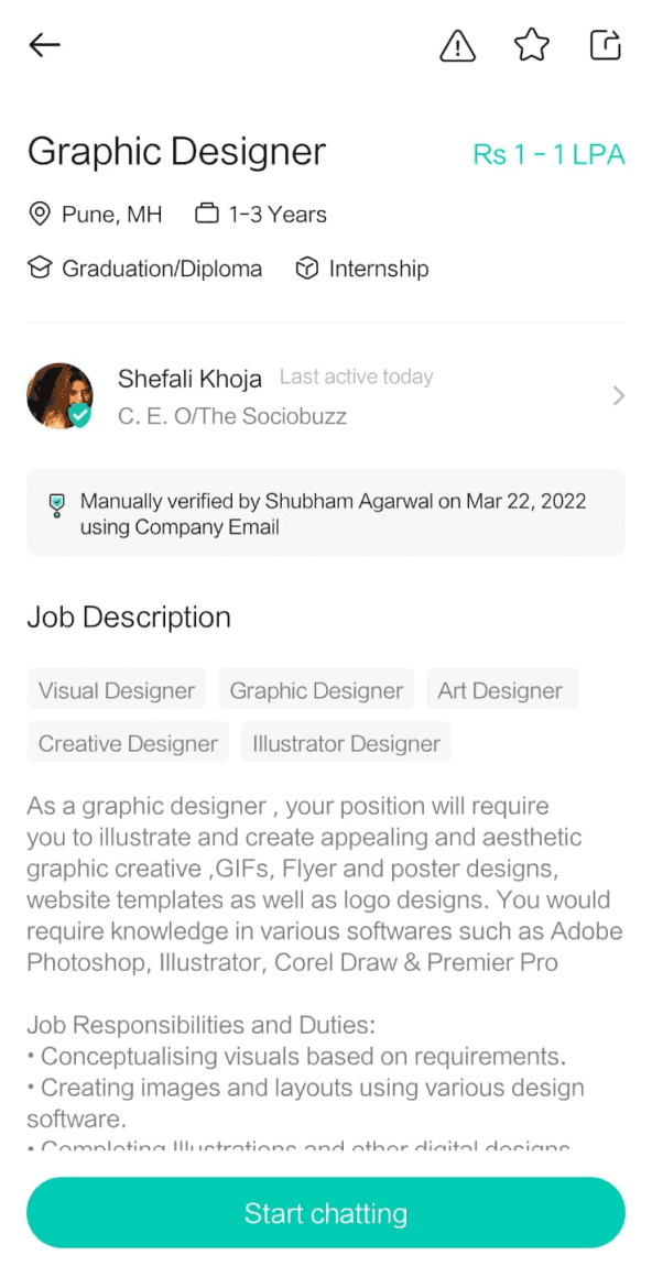
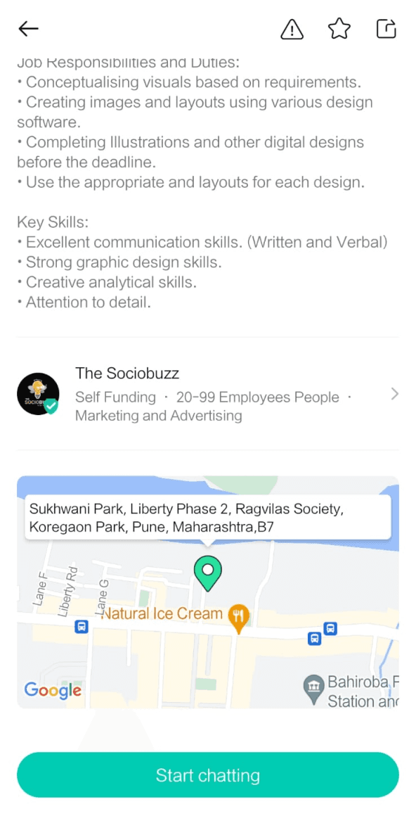
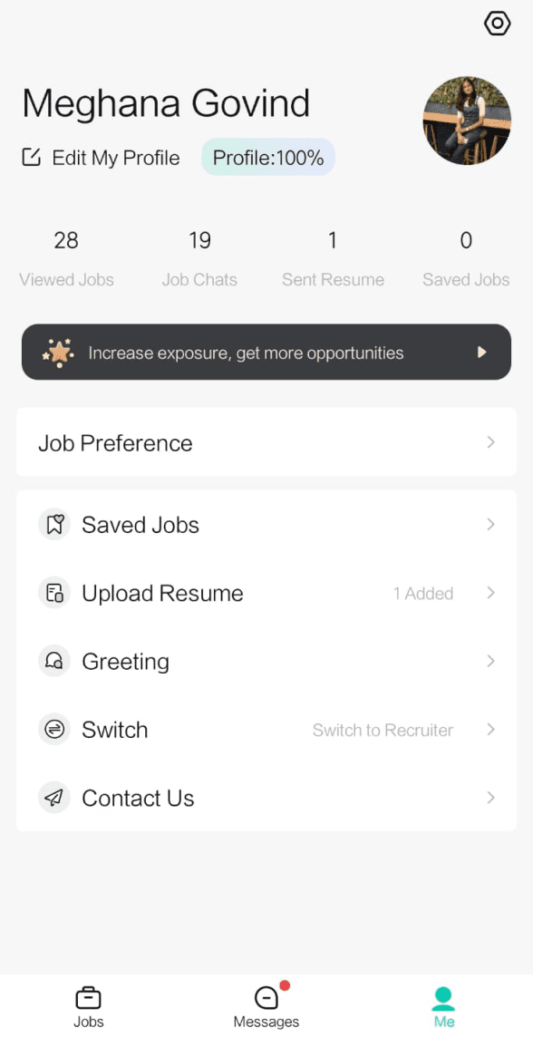
Conducted comprehensive screenshot captures of every job seeker screen within the app for better understanding.
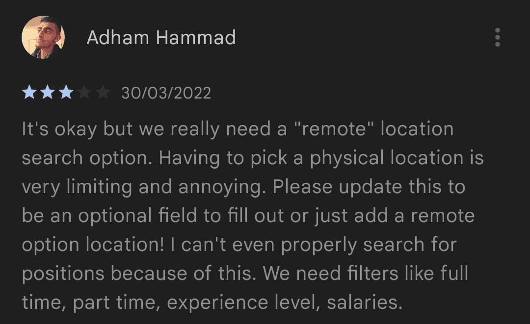
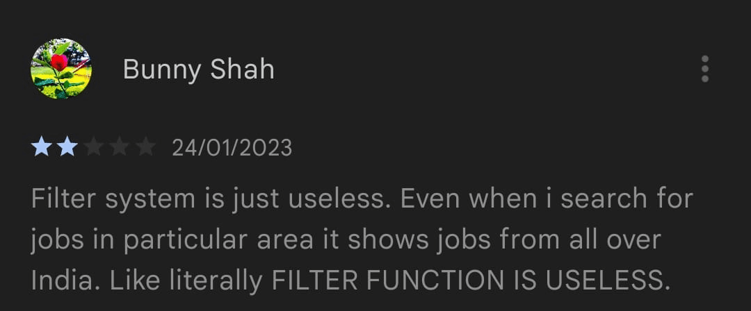
No inclusion of ‘remote’ option
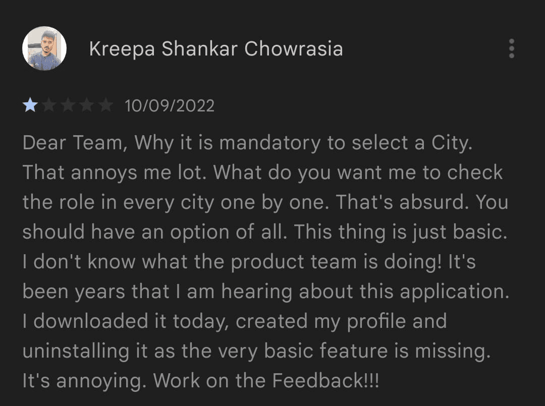
Easy way to access job listings
from across the country.
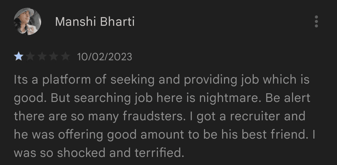
No clarity on the usage of user data
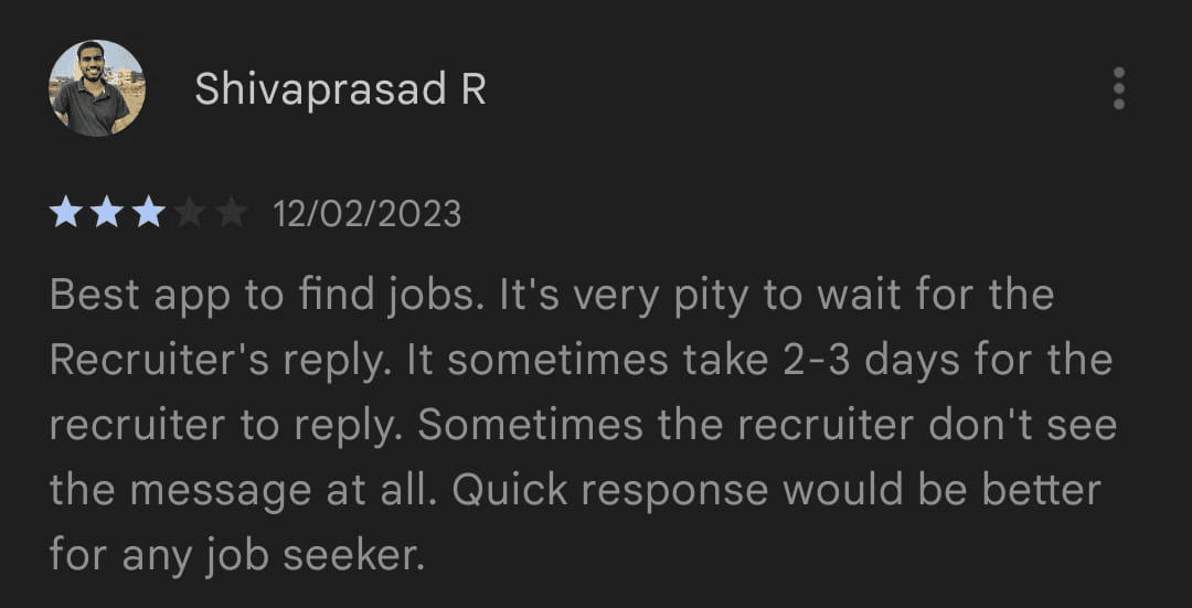
Inadequate responses from recruiters
Lack of distinction between
verified and unverified recruiters.
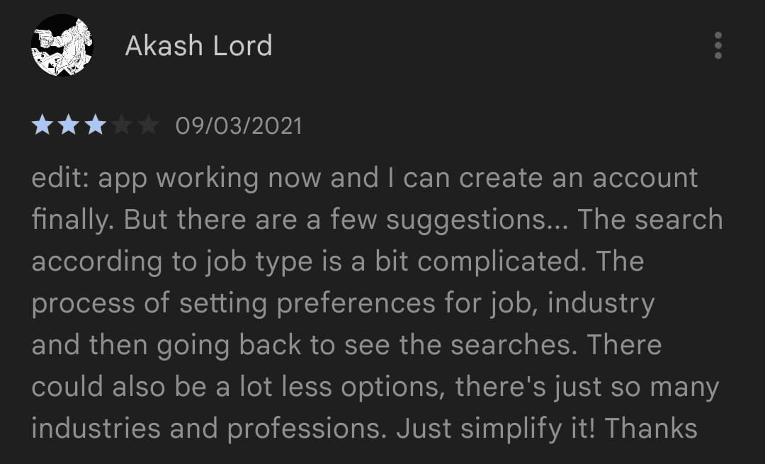
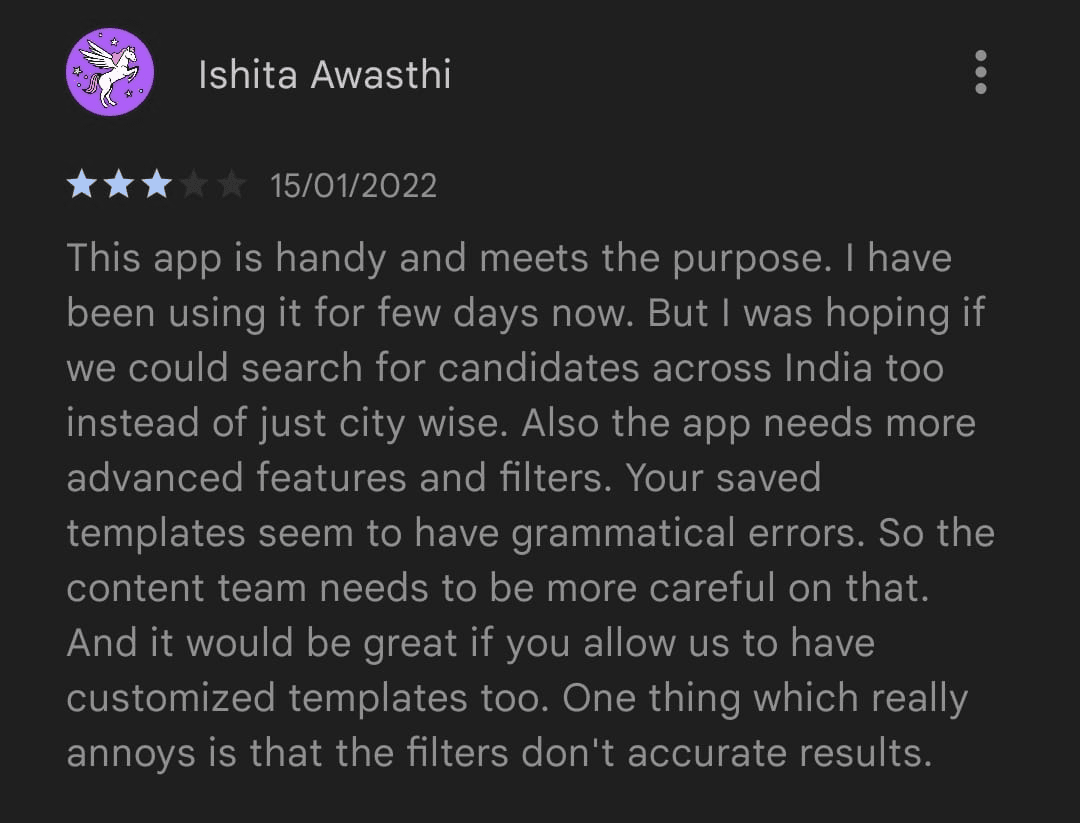
Poor Filtering options
Absence of options to create
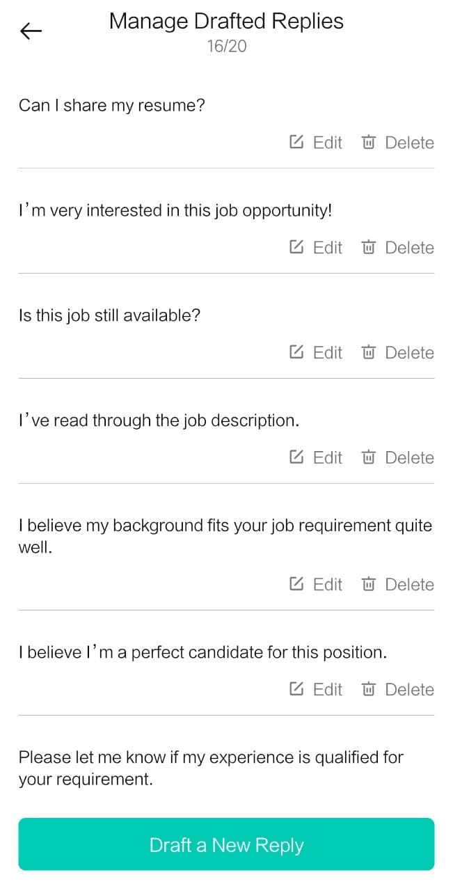
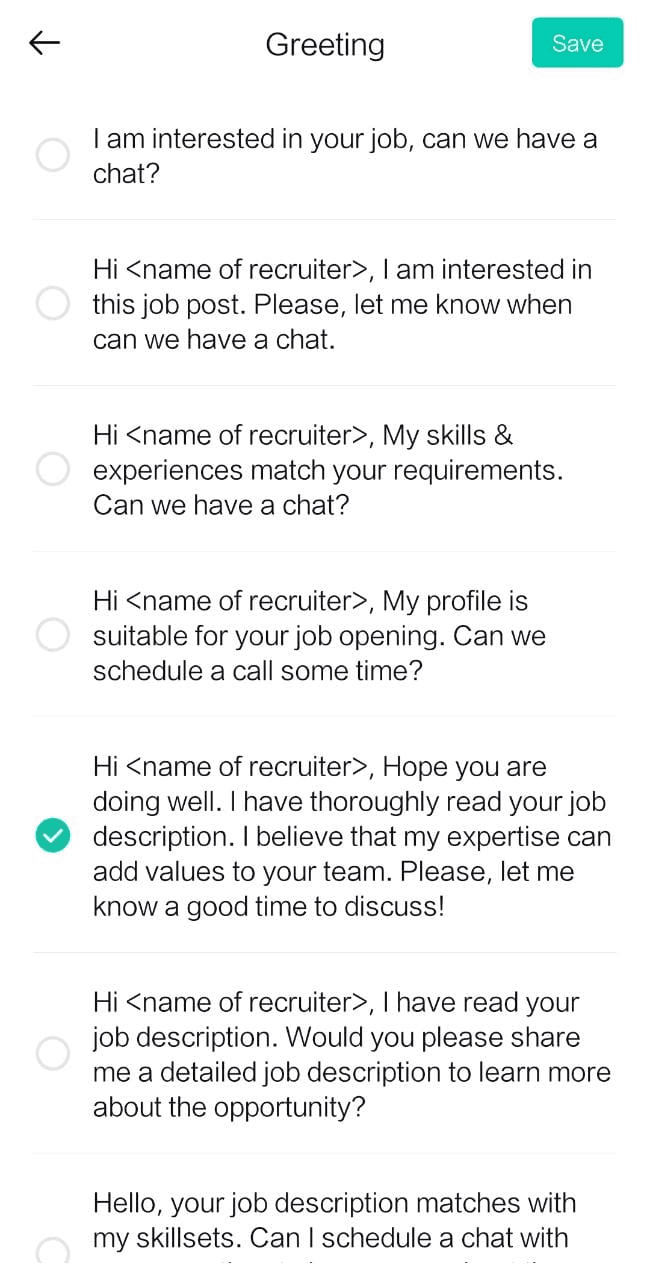
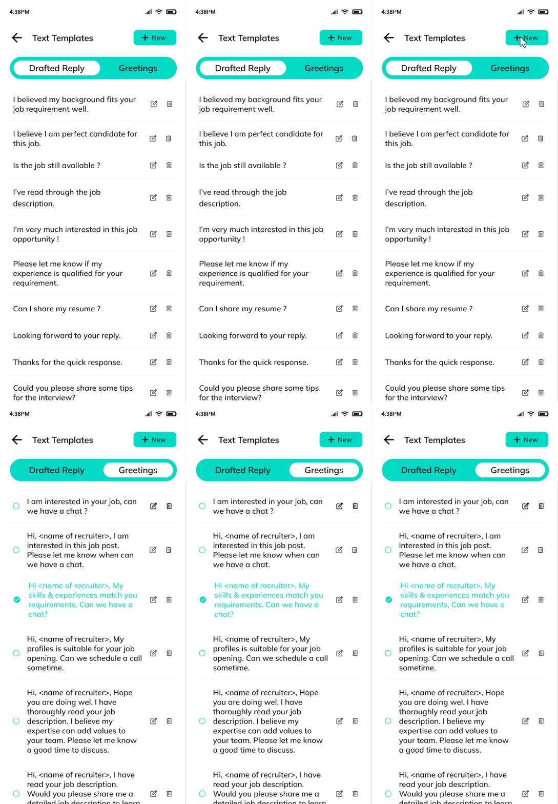
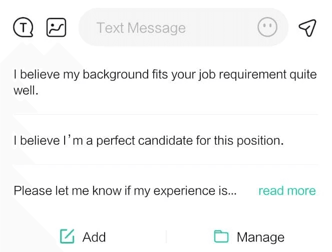
personalized text templates.
The Redesign
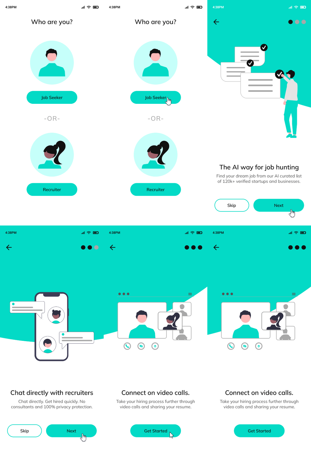
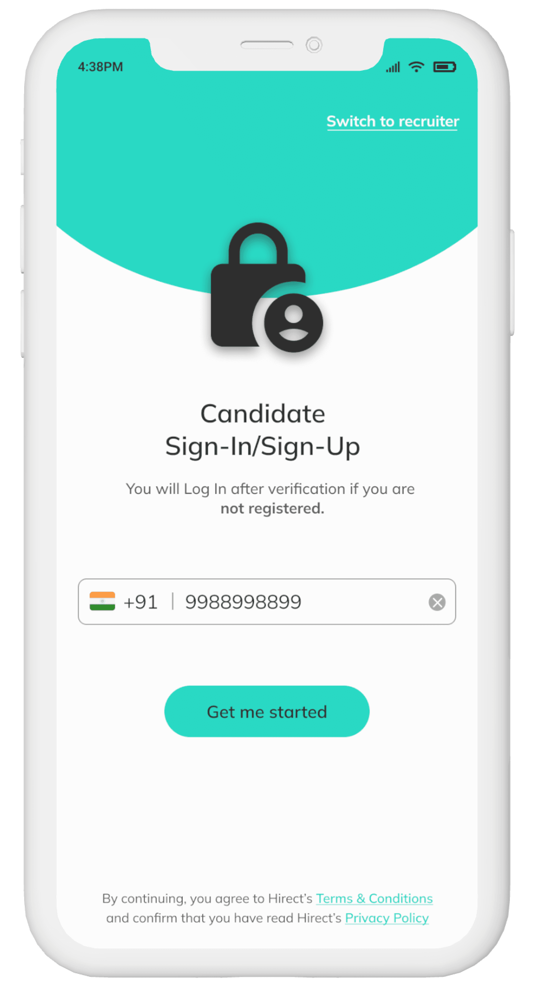
The Onboarding page.
Hirect has some unique features such as using AI for giving perosnalised job recommendations but lacked onboarding screens. Hence, I created onboarding screens to communicate the app’s value to the user
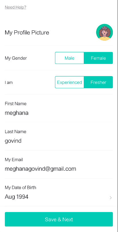
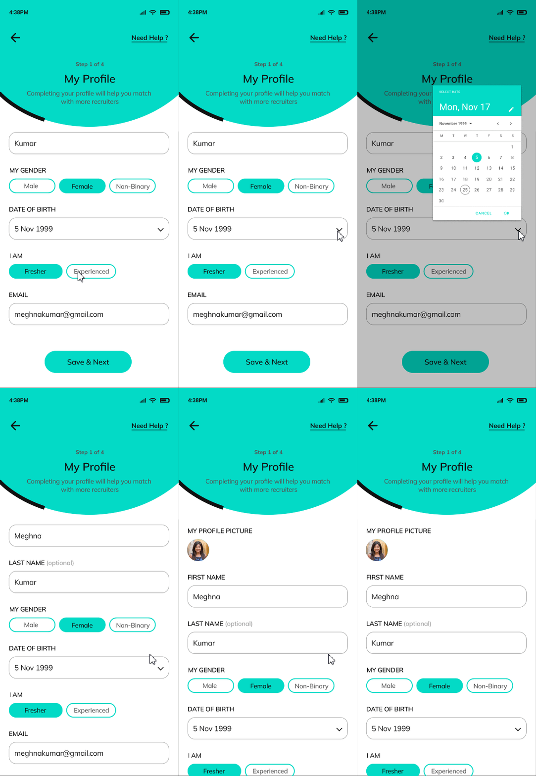
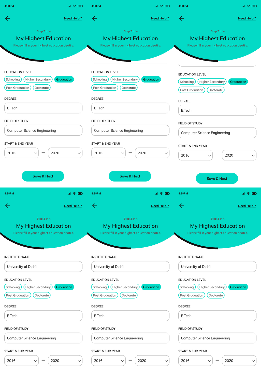
The profile creation pages
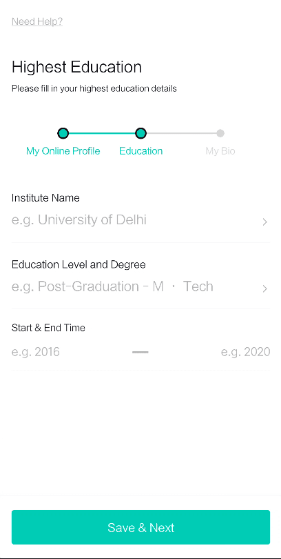
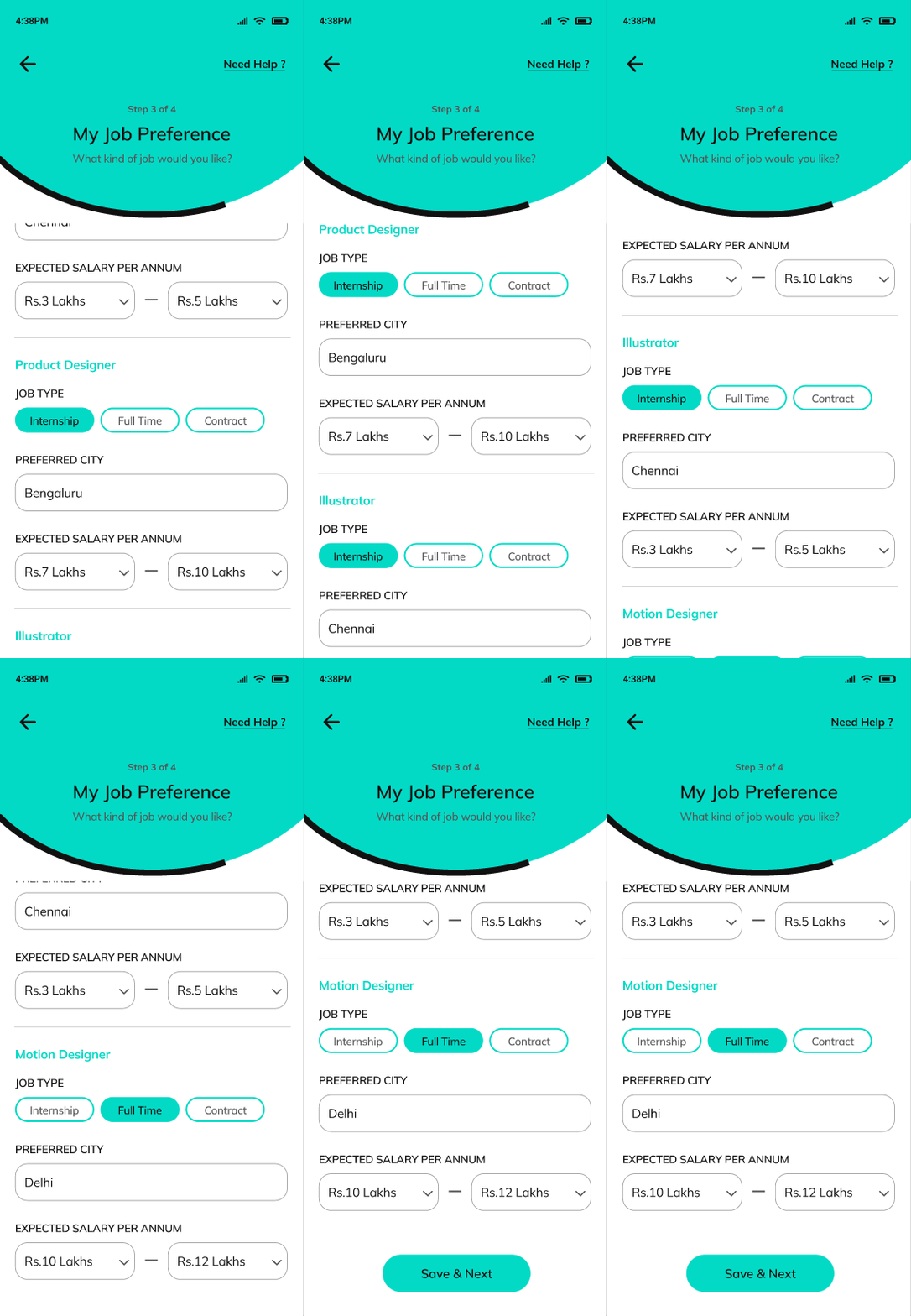
Profile creation in Hirect consists of 3 steps - Job preferences, Profile, Education (including uploading Resume and Bio). This order clearly did not make sense, hence I restructured it as follows.
Order in which the information was asked did not make sense. For example, gender is asked followed by the name. Hence i rearranged that.
The progress bar starts in the middle of the second step in profile creation process. I changed that to start right from the first step.
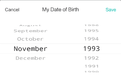
Hirect uses an outdated scrolling UI to pick dates, courses, etc. I replaced them with normal calendar, drop down menus.
Overwhelming amount of options to choose from while selecting functional area and preferred city. Hick's law states increasing the number of choices will increase the decision time of users. Hence, I provided an option to directly type in the necessary details
Additionally, users can now select preferred city, job type and expected salary differently for each functional area.
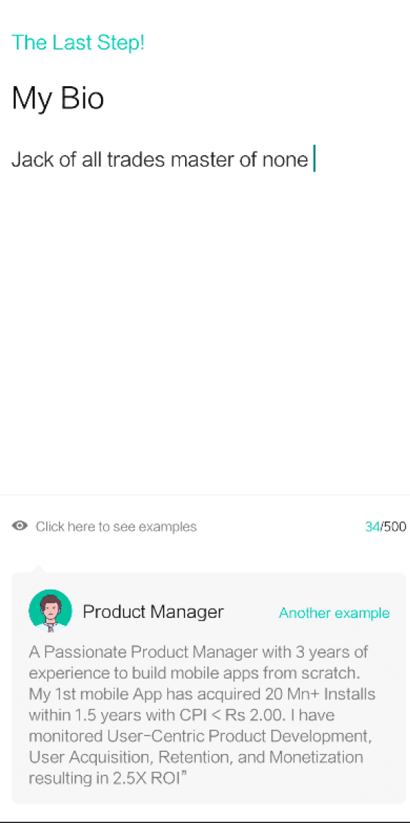
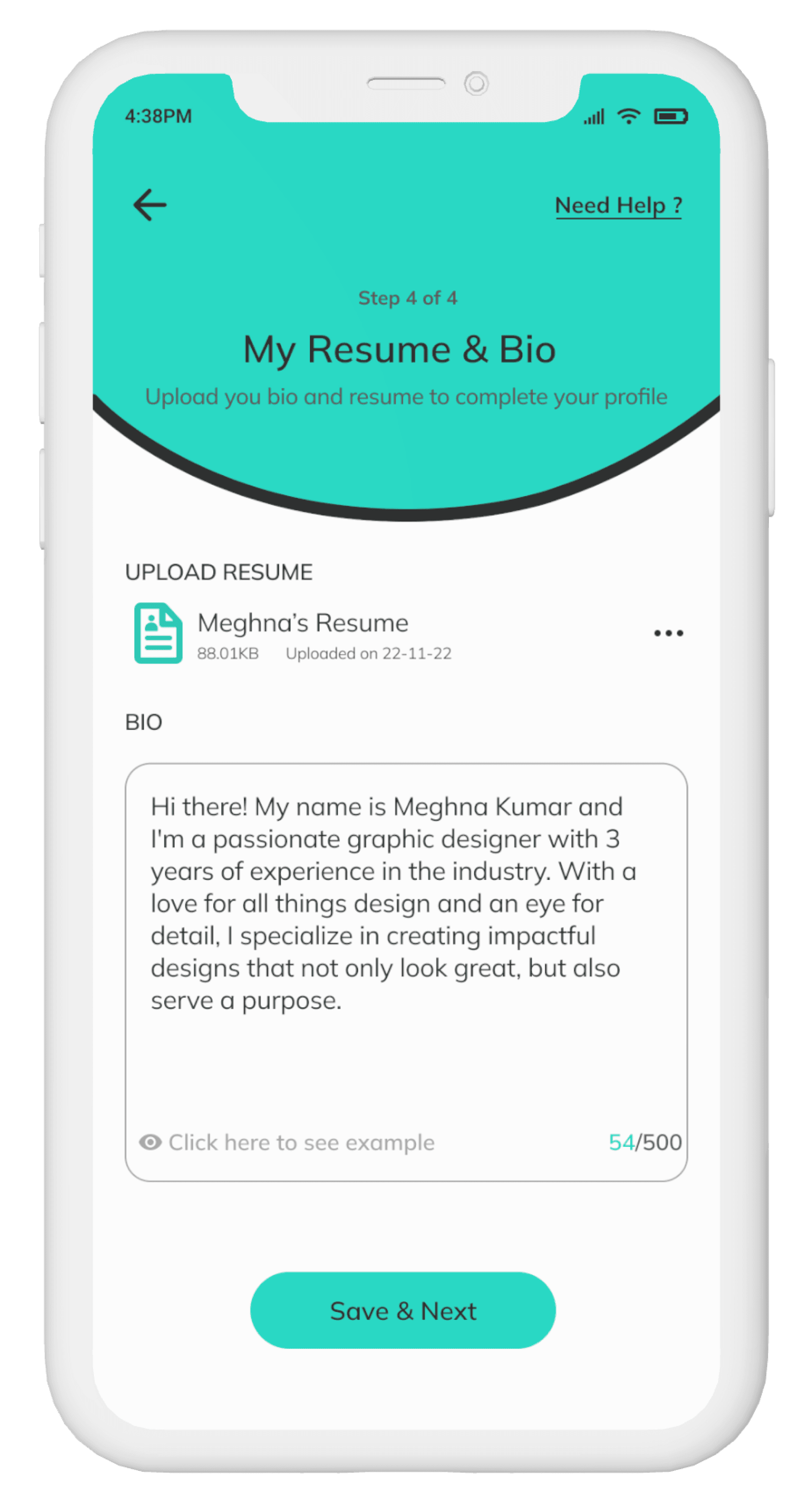
Resume is the most important while seeking jobs. The app does not ask to upload resume while creating the user profile. Hence I added that feature.
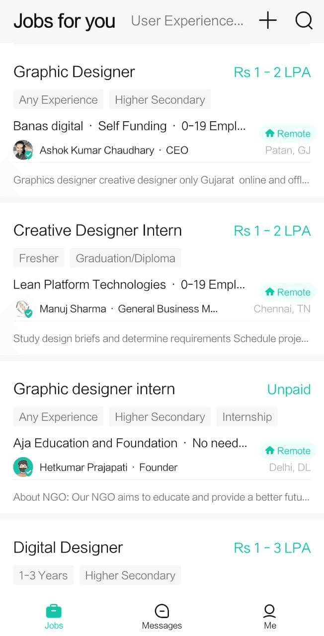
The home screen ( job listing page)
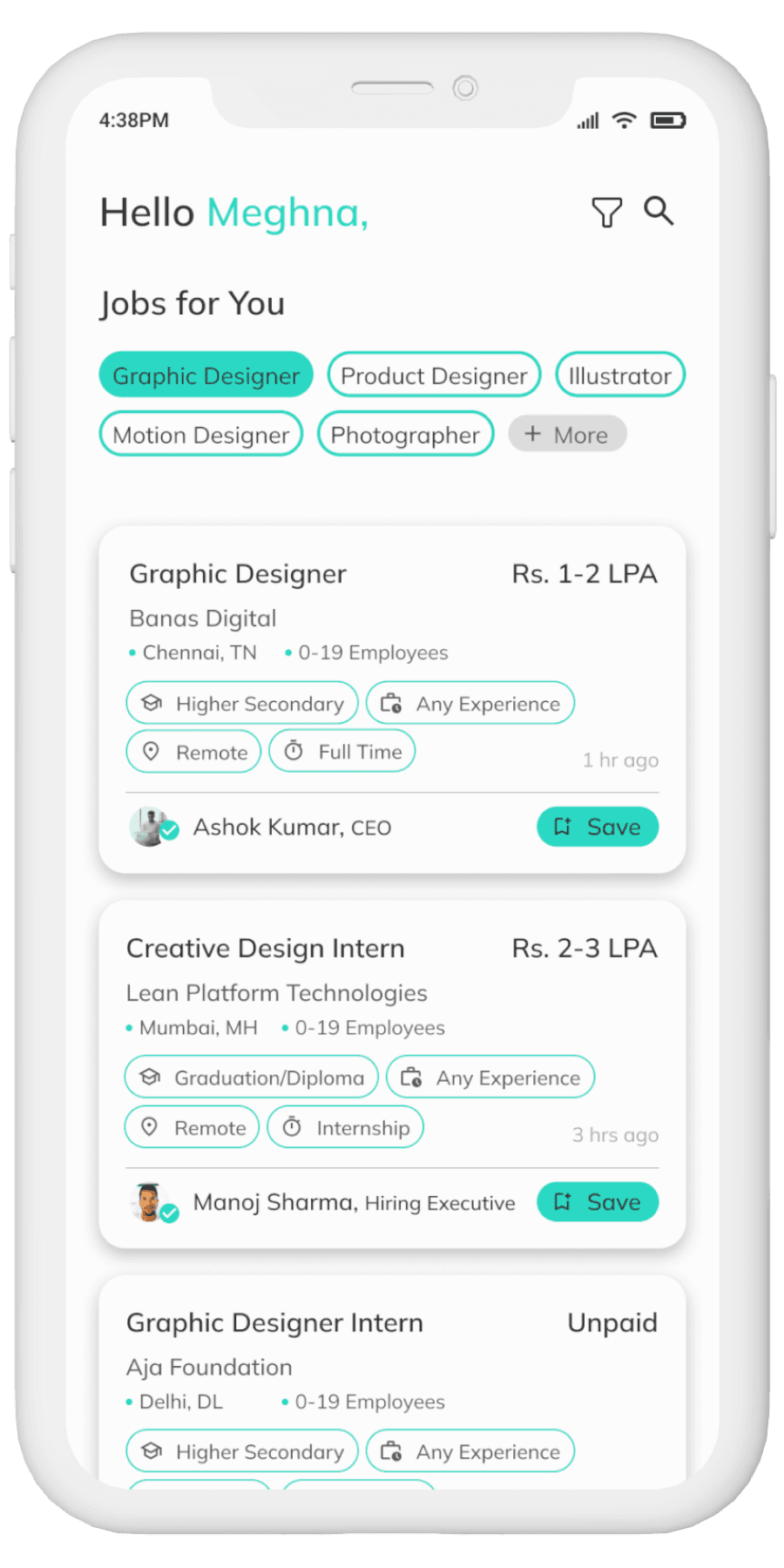
Users are unaware that they can scroll through the top nav bar to find separate job openings for each functional area. I replaced that with chips for better understanding.
I changed the cluttered job listing cards to much cleaner UI with proper visual hierarchy for all the information presented.
Currently, there is tick mark for all job posters which creates a confusion between verified and unverified job posters. Hence only verified job posters have the tick mark.
Added a filter icon on the home page to filter through the job recommendations
The search and filter screen
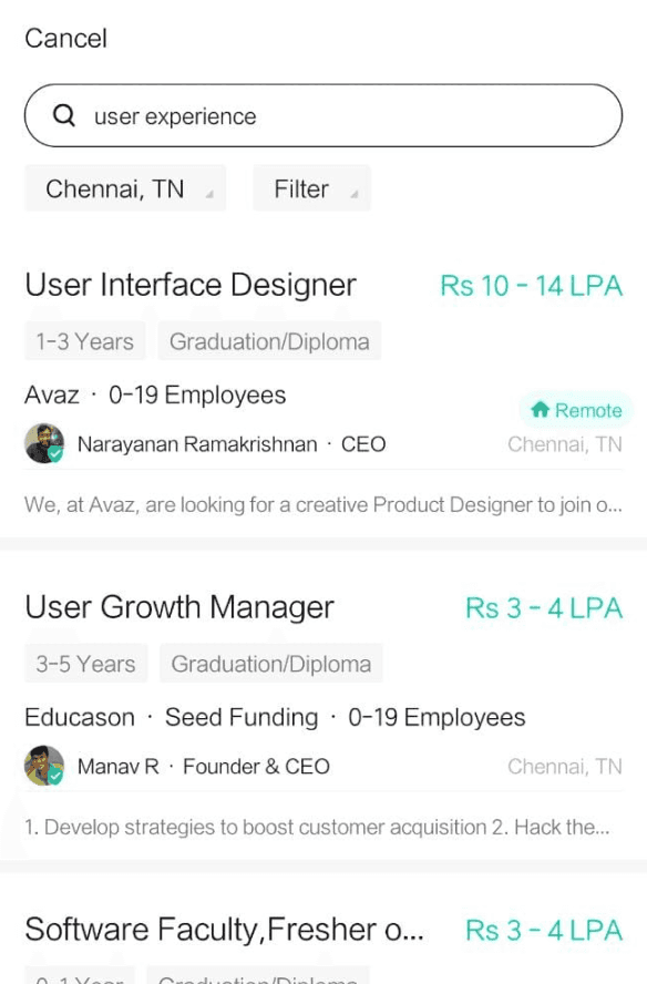
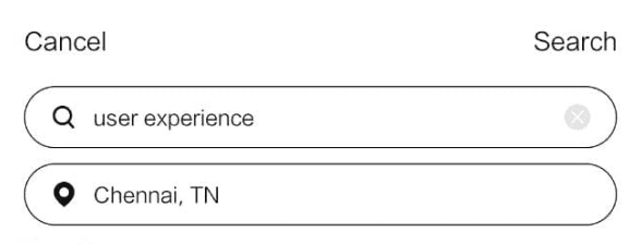
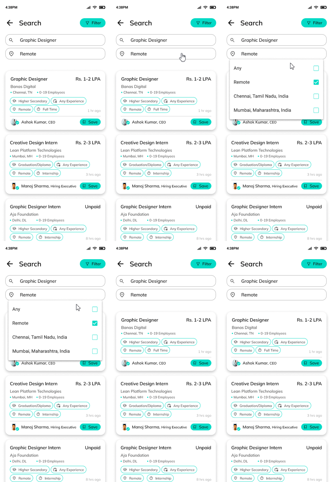
Location search option allows users to only search city wise and lacks remote option. Now, users can search across various cities and for remote work by using the 'Any' and 'Remote' option.
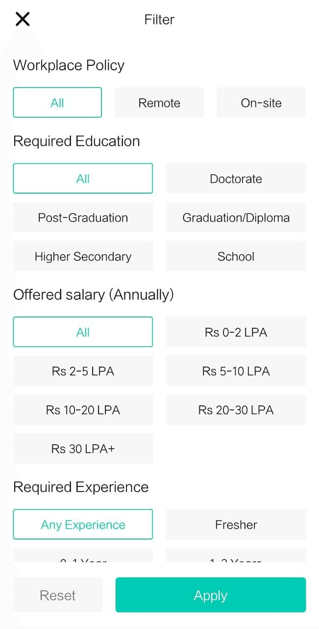
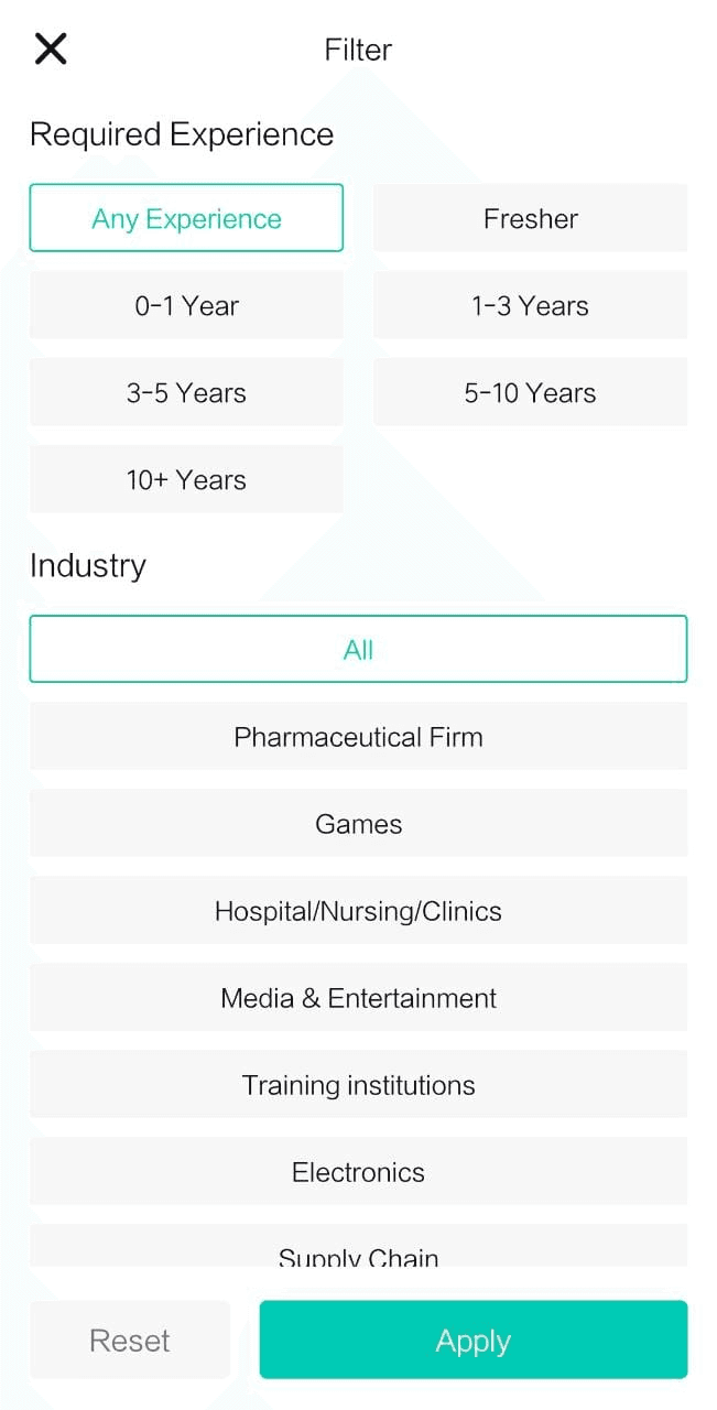
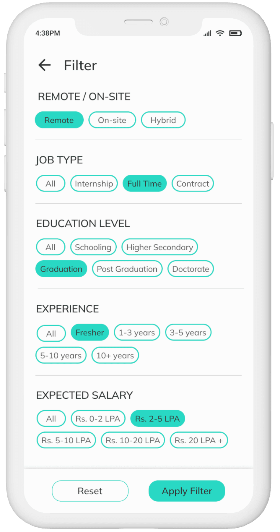
Filter feature is unclear and has an overwhelming amount of options for users. Again, with the use of Hick's Law, I have only added essential features.
'Cancel' and Search' placed at inaccessible positions to users. I replaced 'Cancel' with arrow for UI consistency and Search results auto-display after user's search input.
The chat screen
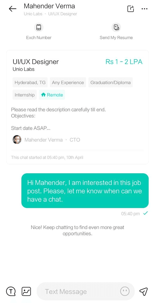
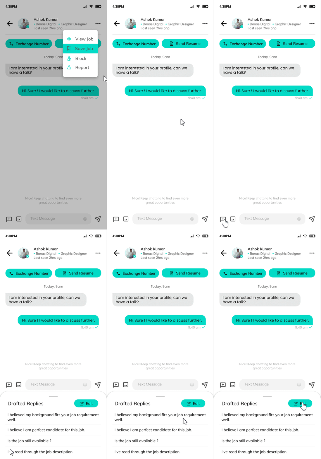
There is too much information about the job on the chat window, which makes it feels cluttered. So i have added only the basic details and provided a 'view job' option in the menu.
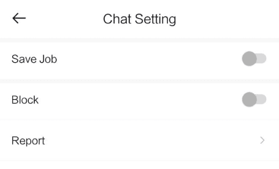
‘Chat settings’ which only has 3 options, opens up unnecessarily in a new page. Hence i changed it into overlay modal within the same screen.
Edit profile screen
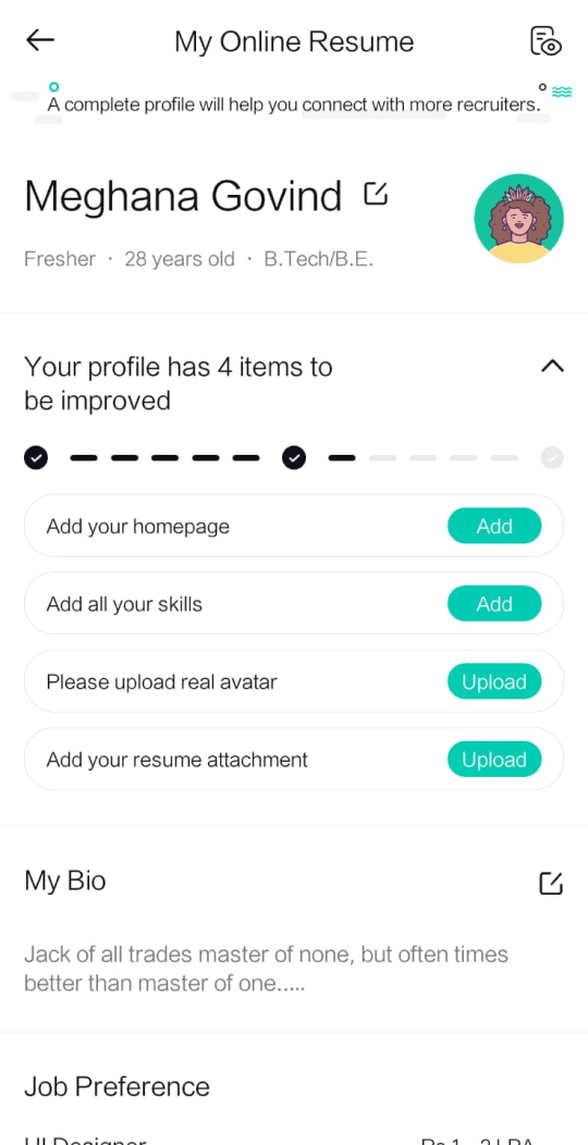
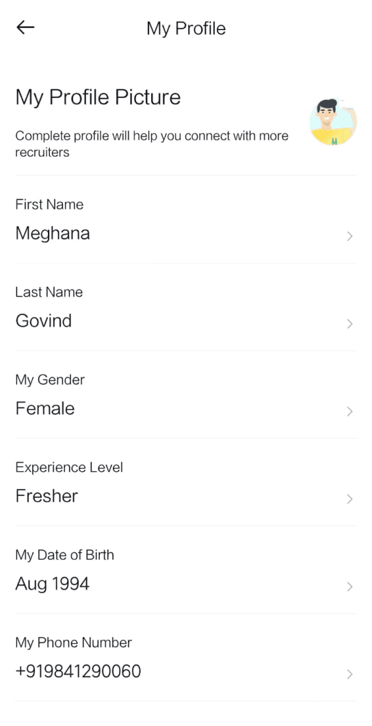
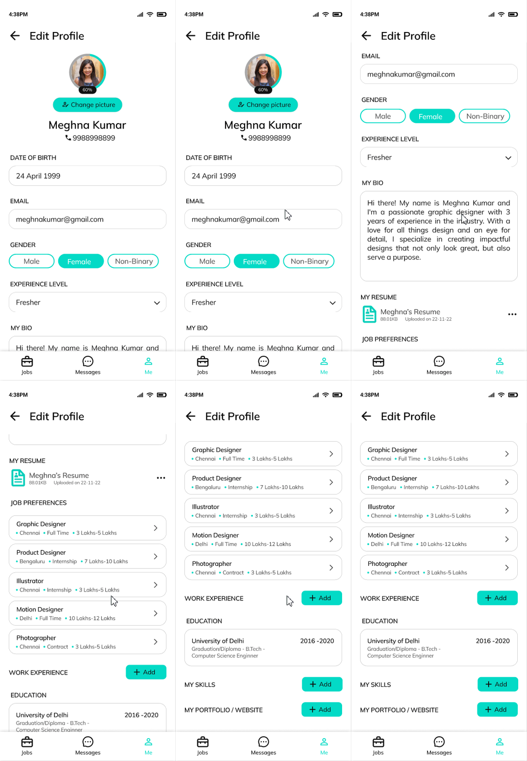
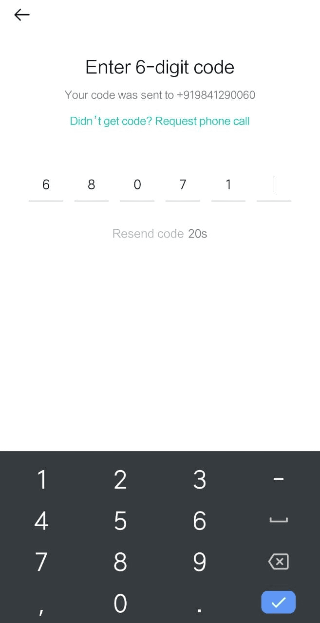
Users are authenticated while logging in using their phone number. Allowing phone number editing enables potential impersonation and the creation of fake profiles. Thus that option was removed.
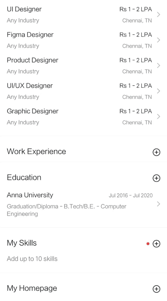
Editing any of the details directs users to a separate editing page instead of allowing them edit on the same screen and there were two different main screens for editing user profile. Now, there is only a single screen to edit all details.
‘My Homepage’ is a place to upload the user's portfolio. I renamed it as ‘My portfolio / website’ as that is better UX writing.
Delete account screen
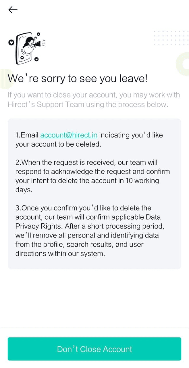
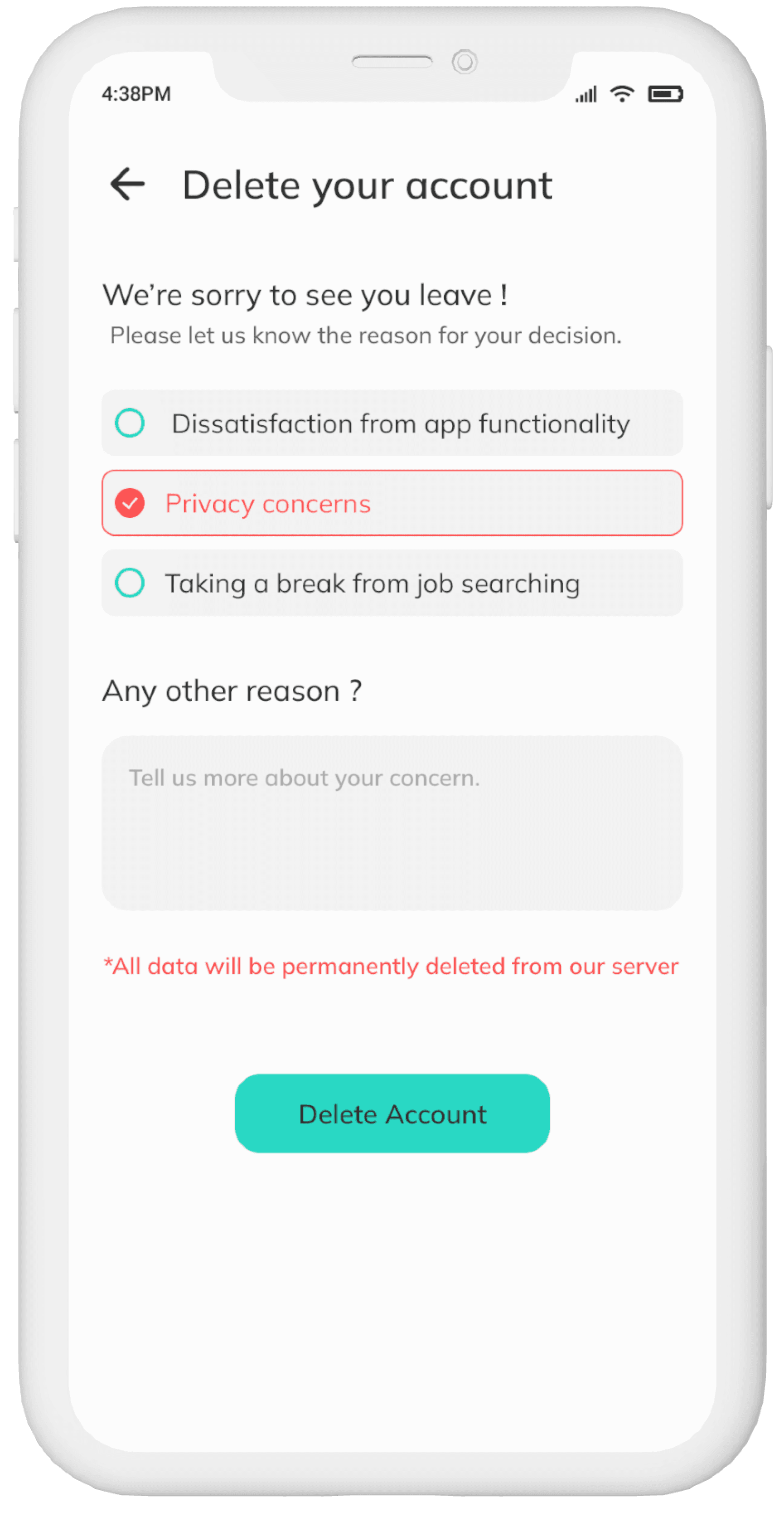
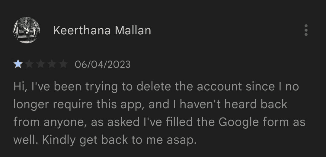
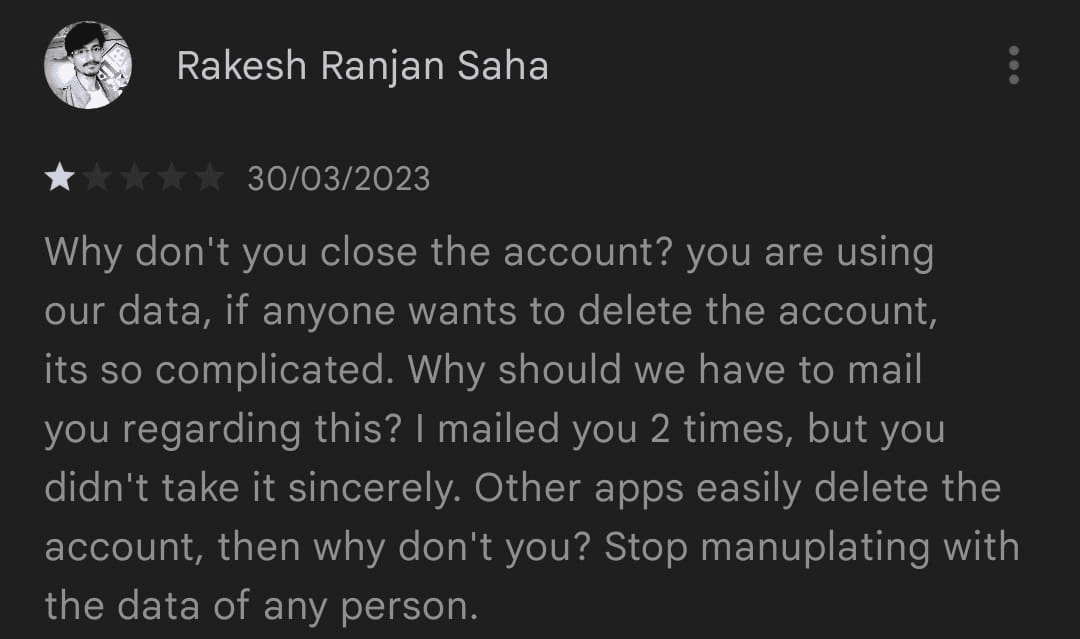
Users found deleting their account by sending repeated e-mails as a cumbersome process. Account deletion is now a simpler process which can be done within the app, saving time for users.
Redesign of other screens
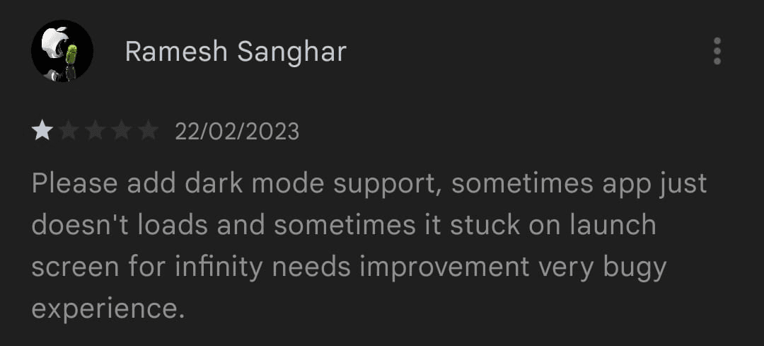
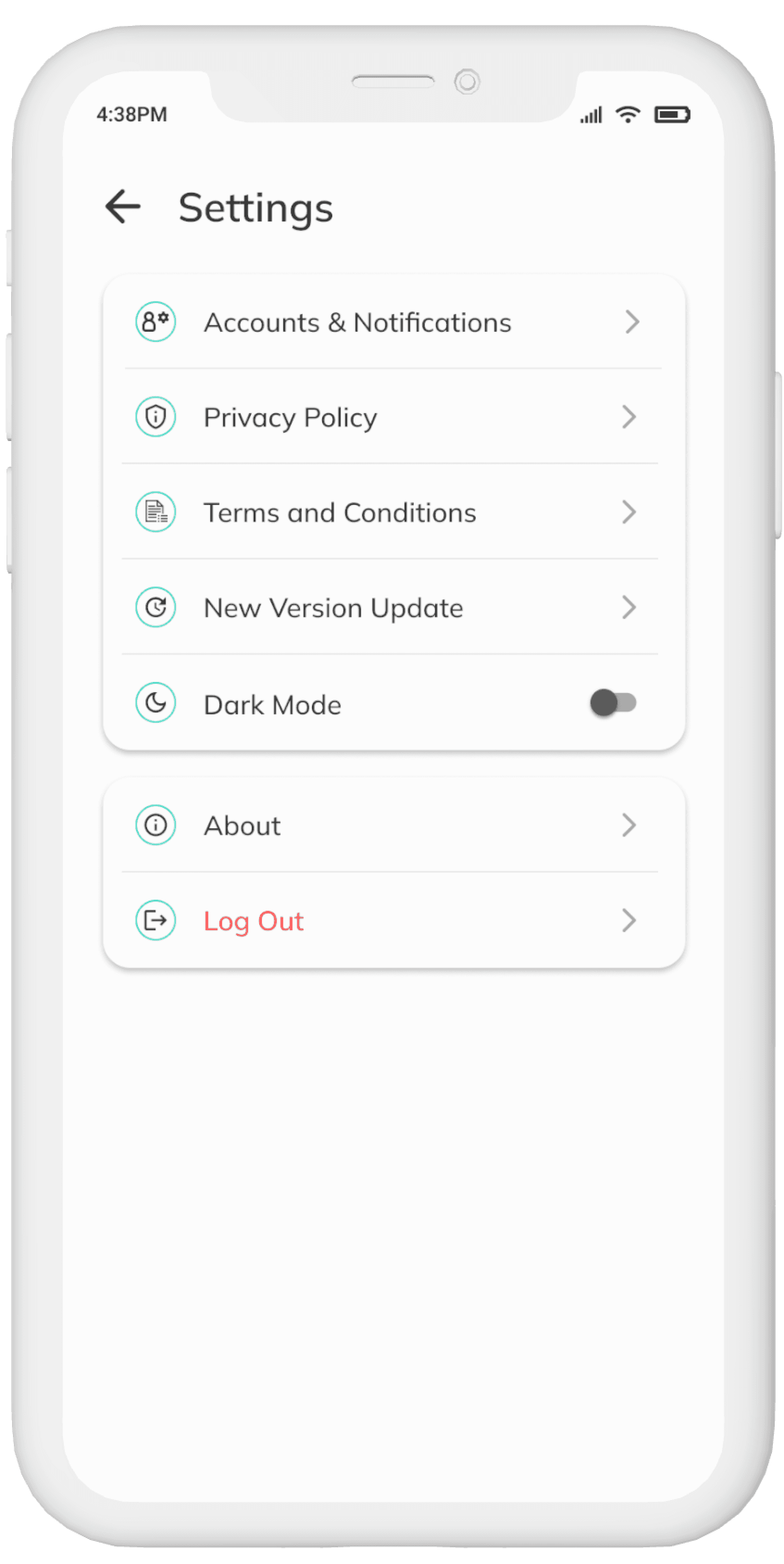
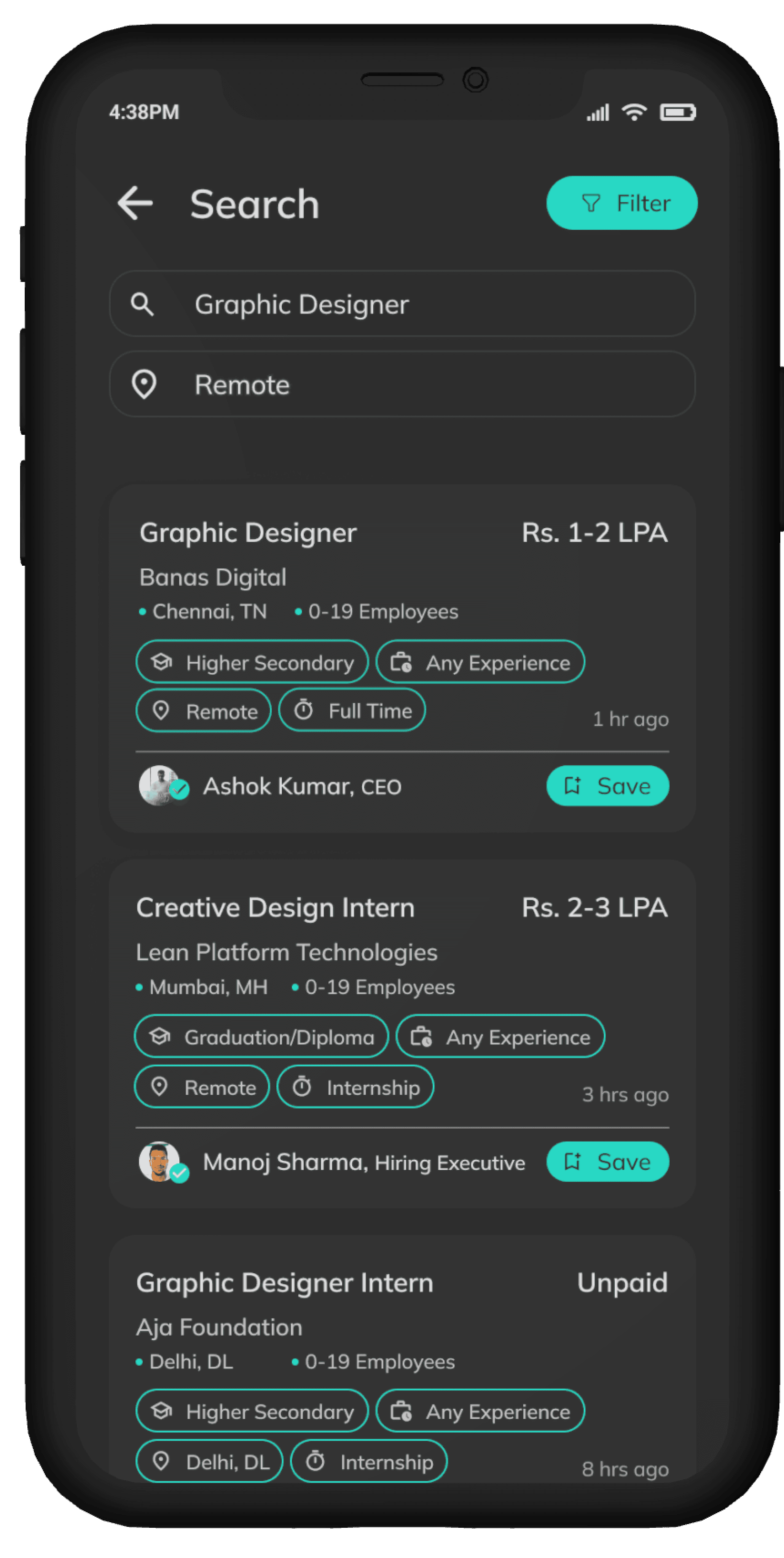
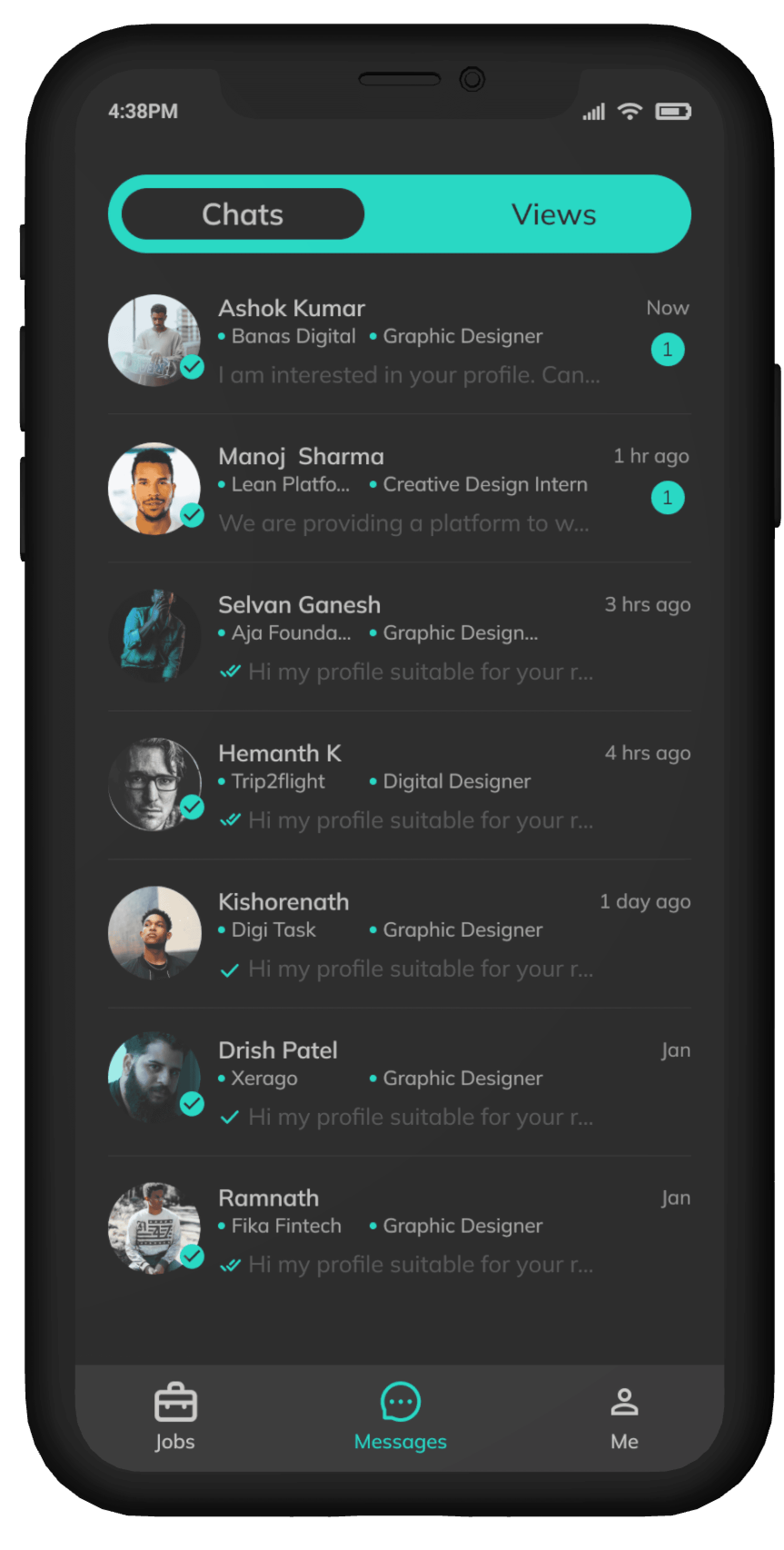
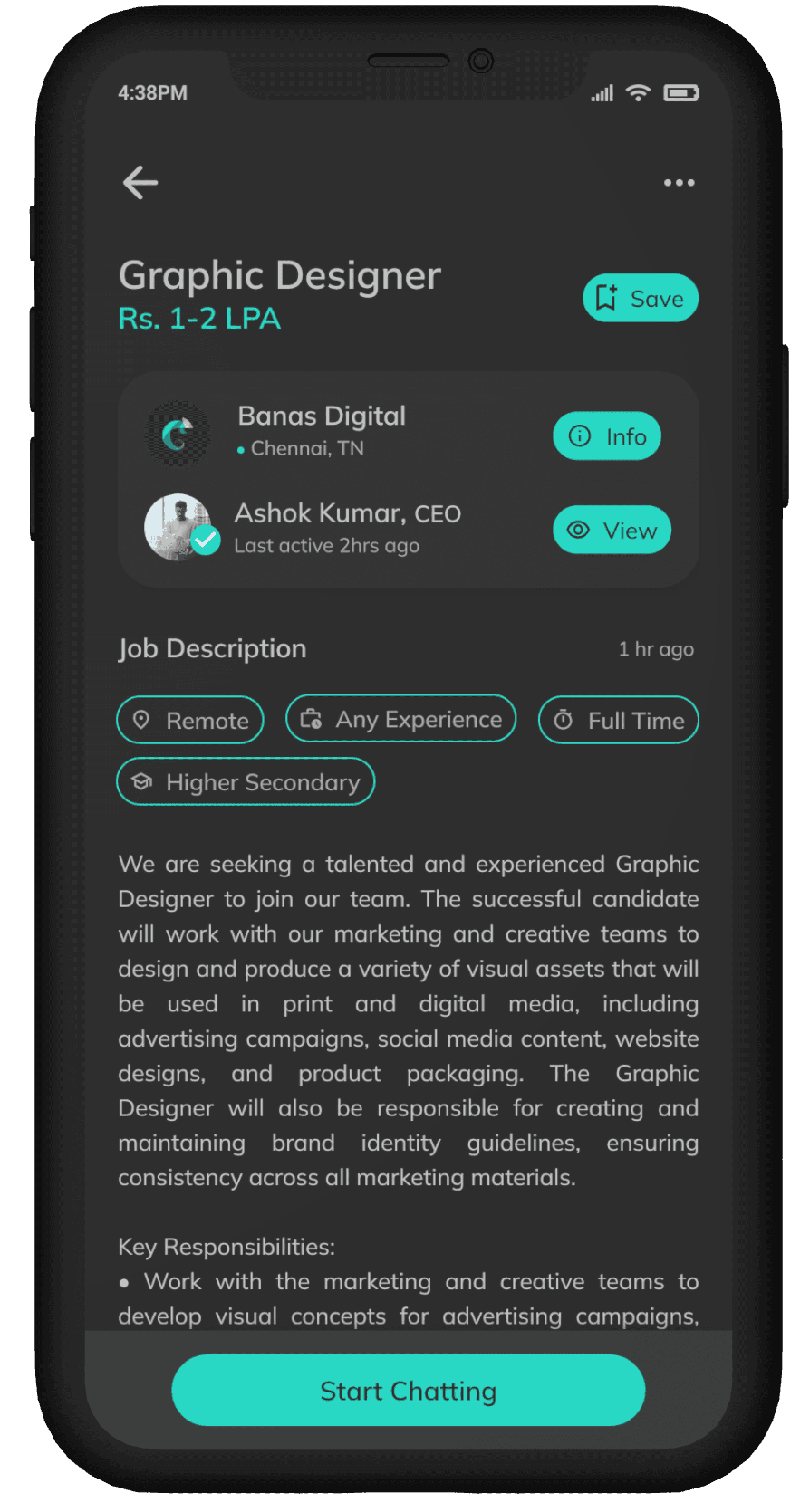
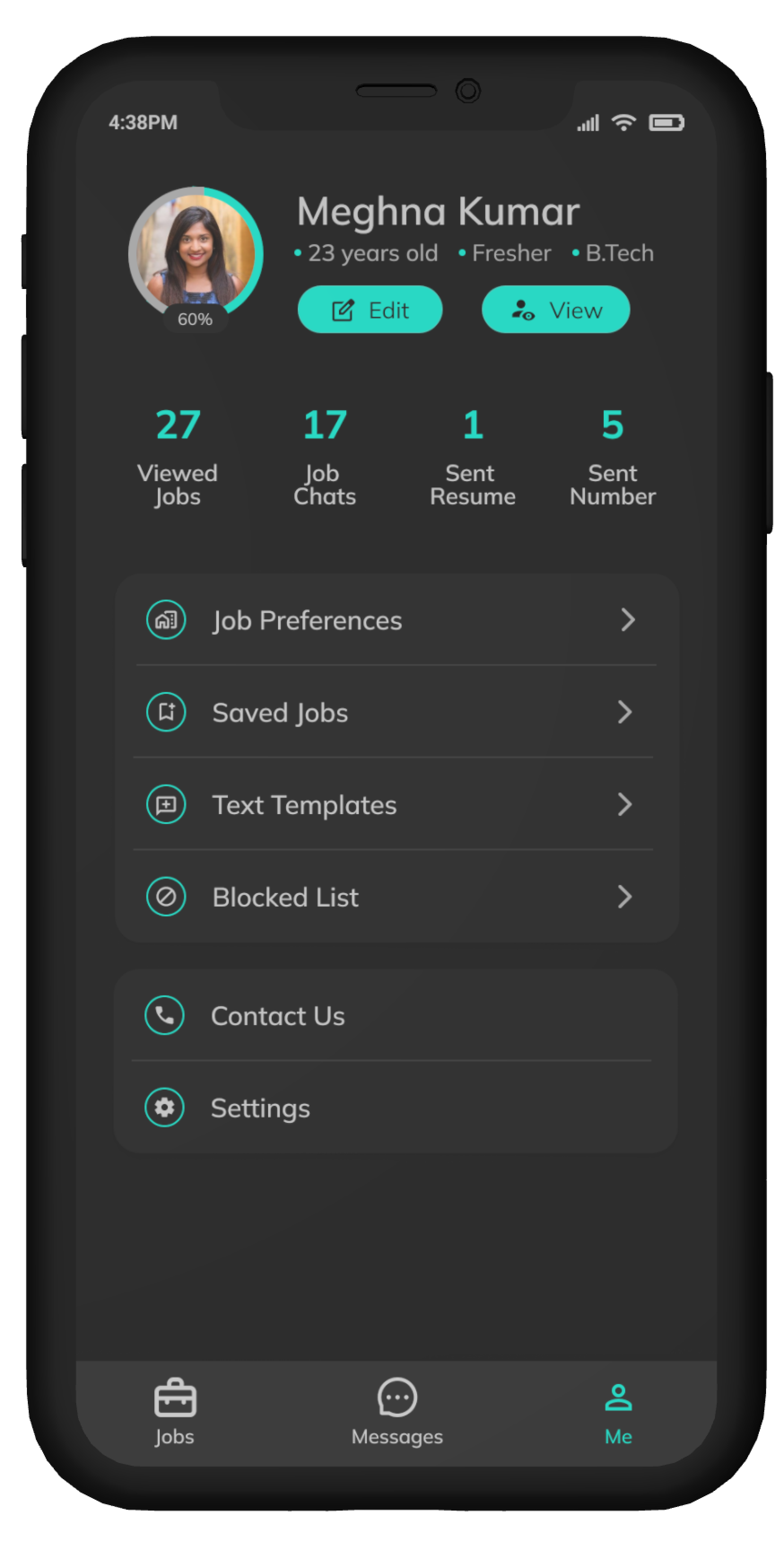
Introducing the dark mode of Hirect.
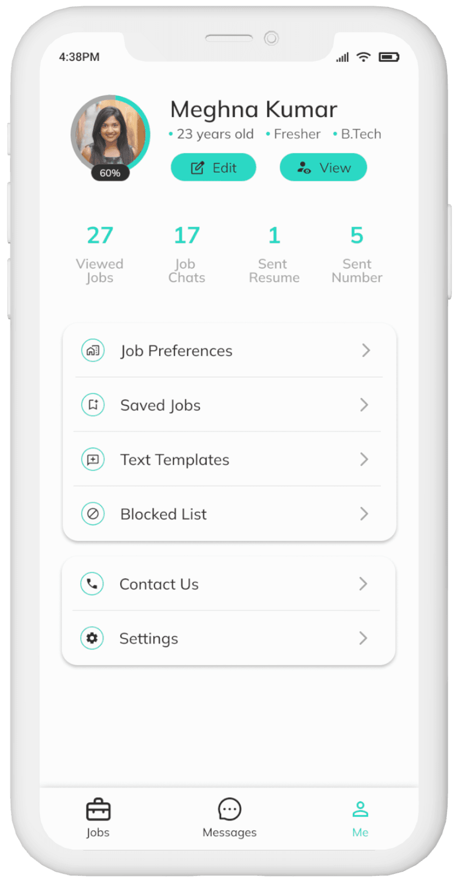
Instead of just adding a toggle button to switch to dark mode, I went on to designing a dark mode version for Hirect.

Mini Testing
I tested the redesigned screens with a small group of users (mostly my friends in their 20s) to see how well the redesign worked. These people have previously used Hirect. Some of their thoughts are listed below.
Paul Jabez
I can easily find the job listings and information
I need with the improved organization in Hirect
Anush
I uninstalled hirect recently. But if the company were to to
incorporate thesee changes, i shall definitely use it.

Mithul Raj
Hirect had some really good features but the Ui looked
so boring. Now, the new UI is much easier to use.

Sakthi Vinayak
If this were a real app, I would definitely use it it
especially for the dark mode.

Supritha
The app feels to the point with a fresh
look after the redesign.
